Palettes That Look Great in Figma but Break in Code — Here Is How to Build Ones That Don't
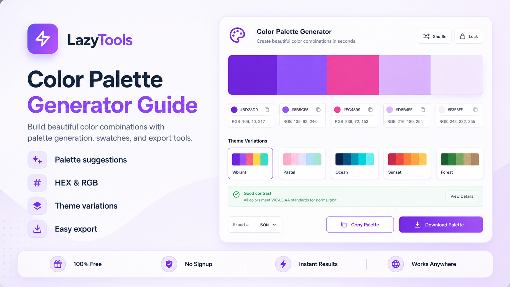
A palette of five beautiful colors means nothing if the shades are wrong for real UI work, the contrast ratios fail accessibility audits, and you have to hand-type every hex value into your config. This generator produces harmony-based palettes with perceptually-uniform OKLab shade ramps, a full WCAG pairwise contrast matrix, and one-click export to tailwind.config.js, CSS variables, SCSS, JSON tokens and Figma — everything a production design system needs from a single tool.
The Three Ways a Beautiful Palette Breaks When Developers Use It
Palette generators have existed for decades and the fundamental problem — starting from one color and finding harmonious companions — is well solved. Specifically, the five classic harmony rules (complementary, analogous, triadic, split-complementary, tetradic) reliably produce colors that look balanced together. Furthermore, every major tool — Coolors, Paletton, Adobe Color — implements them correctly. Consequently, picking five harmonious palette colors is no longer the hard part. The hard part is what comes next, and it is where most free tools stop providing value.
The first failure mode is shade ramps. Specifically, a single hex color is not a design system component — it is a seed. Real UI work requires at least 10 shades of each color: pale tints for backgrounds, mid-tones for borders and muted text, and dark shades for body text on light surfaces. Most palette generators do not generate these shade ramps at all, leaving developers to create them manually — which is where the visual inconsistency enters the system. Furthermore, shade ramps generated by naive HSL lightness interpolation look uneven across different hues because HSL is not perceptually uniform. The OKLab color space, introduced in 2020, solves this: equal changes in OKLab lightness correspond to equal perceived changes in brightness regardless of hue, producing shade ramps that look smooth and even across every color. Consequently, the LazyTools generator uses OKLab mixing for all shade ramp generation, producing ramps that feel much closer to Tailwind's hand-tuned defaults than any HSL-based generator can achieve.
The second failure mode is contrast. Specifically, it is impossible to know which palette colors are safe to use against each other as foreground and background pairs without computing the WCAG contrast ratio for every combination. A color that looks visually distinct from another in Figma may still fail WCAG AA contrast requirements when measured numerically — and accessibility audits catch these failures in production. Furthermore, most palette generators only show contrast against pure white and pure black, which is insufficient for a multi-color UI where your accent sits on your background, your text sits on your surface, and your muted label sits on your card. Consequently, you need a full pairwise contrast matrix — the contrast ratio for every pair of colors in the palette — and the LazyTools generator is the only free tool that provides it.
What Sets This Generator Apart From Coolors, Paletton and Adobe Color
Coolors and Paletton are the household names in palette generation, and they are excellent at the basics — pick five colors, re-roll, lock the ones you like. Specifically, the LazyTools generator does all of that plus three things competitors either paywall or do not offer at all: perceptually-uniform OKLab shade ramps for every palette color, a full WCAG pairwise contrast matrix, and a one-click tailwind.config.js export. Furthermore, every option is free with no login.
From Base Color to Production Palette in Five Steps
🎨 Build Your Production Palette Now
OKLab ramps, WCAG matrix, tailwind.config.js export — free, no login.
Why OKLab Shade Ramps Look Better Than HSL — The Technical Explanation
The fundamental problem with HSL (Hue-Saturation-Lightness) as a color space for shade ramp generation is that HSL lightness is not perceptually uniform. Specifically, equal numerical changes in HSL lightness do not correspond to equal perceived changes in brightness — the relationship between the L value and the perceived brightness depends on the hue. A blue at L=50% looks darker than a yellow at L=50% because human vision perceives yellow as inherently brighter (due to the peak sensitivity of the eye's photoreceptors in the yellow-green range). Consequently, a shade ramp generated by linearly interpolating HSL lightness from the base toward white or black produces a visually uneven progression: some steps look too similar, others look too different, and the midtone weights frequently feel muddy or washed-out depending on the hue.
The Tailwind CSS team solved this problem by manually hand-tuning their default color palette — adjusting each weight of each hue individually until the progression felt visually even across all eleven weights and all thirteen hues. Specifically, this is why Tailwind's built-in colors feel smooth and professionally designed compared to any auto-generated palette. Furthermore, this hand-tuning took significant design time and is essentially impossible to replicate programmatically using HSL. Consequently, most free palette generators produce shade ramps that look noticeably worse than Tailwind's defaults — not because the generator is poorly engineered, but because HSL is the wrong color space for this task.
OKLab is a perceptually-uniform color space designed by Björn Ottosson and published in 2020. Specifically, OKLab's lightness axis (L) is calibrated so that equal numerical changes in L correspond to equal perceived changes in brightness, regardless of hue. Furthermore, OKLab preserves chromatic balance during lightness changes better than HSL — tints do not go washed-out and shades do not go muddy at the extremes. Consequently, mixing toward white and black in OKLab space and converting back to sRGB hex produces shade ramps that feel much closer to Tailwind's hand-tuned defaults than any HSL-based approach. The LazyTools generator uses OKLab mixing for all 11 weights of every shade ramp — making it one of the very few free tools that produces perceptually-correct shade progressions.
The Full Pairwise WCAG Matrix: The Feature No Other Free Palette Tool Has
The Web Content Accessibility Guidelines (WCAG) define minimum contrast ratios for text against its background: 4.5:1 for normal body text at WCAG AA, 3:1 for large text (18pt+ or 14pt+ bold) or UI components, and 7:1 for WCAG AAA compliance. Specifically, these ratios are computed from the relative luminance of the two colors — a value derived from the linear RGB components of each color using the sRGB to linear conversion formula. Furthermore, the contrast ratio formula always places the lighter color in the numerator, so the ratio of two colors is the same regardless of which is foreground and which is background: text contrast is symmetric.
Most palette generators address contrast by showing how each palette color contrasts against pure white (#FFFFFF) and pure black (#000000). Specifically, this is useful for knowing whether a color can be used as a CTA button background with white text, or as a body text color on a white page — but it misses the critical use case of palette colors used against each other. Furthermore, in a real product, the background-foreground combinations are not always white and black — your primary button uses your accent color as background with your darkest shade as text, your secondary button uses your lightest shade as background with your primary color as text, and your card uses your mid-tone as surface color with your label color as text. Consequently, you need the contrast ratio for every pair of palette colors — not just each color against white and black.
The LazyTools WCAG matrix shows every pair. With a five-color palette, that is 10 unique unordered pairs (5 choose 2), displayed as a symmetric 5x5 grid with the diagonal (same color vs itself, always 1:1) highlighted differently. Specifically, each cell is shaded green when the pair passes WCAG AA for normal text (4.5:1+), yellow when it passes only for large text or UI components (3:1 to 4.5:1), and red when it fails. Furthermore, hovering any cell shows the exact numerical ratio. Consequently, the matrix instantly shows which color combinations are safe for production use — information that would otherwise require running 10 separate contrast checks in a dedicated accessibility tool.
The 5 Color Harmonies: Angles, Feel and When to Use Each
Each harmony rule produces a different aesthetic because each rotates the base hue by different angles on the color wheel. Specifically, the choice of harmony is one of the most important design decisions in building a visual identity, and most designers either default to complementary (high contrast = strong CTA) or analogous (safe, cohesive) without considering the other three. Furthermore, split-complementary — the most underused of the five — is often the best choice for general-purpose UI design because it combines near-complementary contrast with visual balance.
| Harmony | Hue Rotation | Feel | Best For |
|---|---|---|---|
| Complementary | +180° | High contrast, dramatic, energetic | CTA buttons, sports brands, alert states, maximum visual impact |
| Analogous | ±15° to ±60° | Calm, gradient-like, harmonious | Nature themes, hero gradients, photo overlays, serene UIs |
| Triadic | +120°, +240° | Balanced, vibrant, varied | Playful brands, illustrations, children's products, equal-weight colors |
| Split-complementary | +150°, +210° | Almost complementary contrast, easier on the eye | Most general-purpose UI: dashboards, marketing sites, productivity tools |
| Tetradic (square) | +90°, +180°, +270° | Maximum variety, hardest to balance | Editorial design, multi-section dashboards, festival branding |
🔑 The Secret Weapon: Split-Complementary for UI Design
Split-complementary is the most valuable harmony for practical UI design and the most frequently overlooked. Specifically, a true complementary palette (base + exactly opposite hue) creates two colors that compete for visual attention at maximum contrast — which works beautifully for an icon or a single CTA button but becomes visually exhausting in a full UI where both colors appear at scale. Furthermore, split-complementary uses the base plus the two colors positioned 150° and 210° from it (rather than exactly 180°), which splits the complementary contrast across two supporting colors. Consequently, neither supporting color commands as much attention as a direct complement would, making the palette feel more balanced and less jarring when both the base and accent appear in the same interface at comparable sizes. Most professional UI designers use split-complementary for general-purpose work and reserve pure complementary for brand identities where maximum contrast between exactly two colors is the goal.
The Complete Design System Workflow: Base Color to Production-Ready Code
The hardest part of starting a design system is turning one color you love into a complete palette that supports every UI state — body text, subdued labels, hover states, disabled states, error states, success states, backgrounds at five different elevations. The following workflow, which the LazyTools generator supports end-to-end, produces a palette that survives both design review and accessibility audit.
Step 1: Choose the Right Base Color
Three properties determine whether a base color will generate a useful design system. Specifically, the base color should have HSL lightness between approximately 45% and 65% — this gives headroom to generate lighter tints for backgrounds and darker shades for text without running out of contrast at either end. Furthermore, saturation between 55% and 90% produces vibrant but workable colors — fully saturated colors (100% S) generate shade ramps that go muddy in the middle weights. Additionally, the base color should be distinctive enough to anchor a brand but not so saturated or unusual that the supporting harmonies look strange beside it. The generator's Smart Random mode follows exactly these constraints when generating random base colors.
Step 2: Generate Shade Ramps Using OKLab
Once you have your five harmony colors, each one needs a complete shade ramp from 50 to 950 for real UI work. Specifically, the convention (popularised by Tailwind CSS) uses 11 weights: 50, 100, 200, 300, 400, 500, 600, 700, 800, 900 and 950. The base color usually sits at weight 500 or 600. Tints (50 through 400) are progressively lighter versions used for backgrounds, borders and muted states. Shades (600 through 950) are progressively darker versions used for body text, hover states and high-contrast elements. Furthermore, as described in the OKLab section, the mixing must be done in OKLab space rather than HSL to produce visually even progressions. Consequently, the LazyTools generator handles this automatically — click any swatch in the ramp to copy its hex, or export the complete ramp in your preferred format.
Step 3: Verify Contrast Across Every Pair
With shade ramps generated, the WCAG matrix becomes even more useful — you can check not just the five base palette colors against each other, but also test specific shade weight combinations for your intended use cases. Specifically, check that your darkest shade (900 or 950) achieves at least 4.5:1 contrast against your lightest tint (50 or 100) — this is the body-text-on-light-background combination that will appear most frequently in your UI. Furthermore, check that your 500-weight primary color achieves the required contrast against white when used as a button background with white text — if it fails, you need a darker shade (600 or 700) for the button background instead. Consequently, the contrast matrix drives shade weight selection for every foreground-background combination in the design system before any component is built.
Step 4: Export and Use in Your Project
The Tailwind.config.js export is the fastest path from palette to working code. Specifically, the exported snippet looks like this: a theme.extend.colors block with each palette color named (brand, accent-1, accent-2 by default — rename as needed) and its full 11-weight ramp expanded. Furthermore, dropping this snippet into your Tailwind config immediately enables classes like bg-brand-500, text-brand-900, border-accent-1-300 and ring-accent-2-700 throughout your project. Consequently, the total time from opening the generator to having a working Tailwind design system is typically under two minutes — compared to the 30-60 minutes required to manually create, name and enter 55 hex values for a five-color palette with full shade ramps.
Five Export Formats: CSS Variables, SCSS, Tailwind, JSON Tokens and Figma
The generator provides five copy-ready export formats, each designed for a specific workflow. Specifically, each format is a complete, ready-to-paste code block that requires zero manual editing before use.
| Format | Output | Best For |
|---|---|---|
| CSS Variables | :root block with --brand-50 through --brand-950 for each color | Vanilla CSS, any framework, CSS custom property design tokens |
| SCSS | $brand-50 through $brand-950 Sass variable declarations | Legacy Sass projects, Bootstrap customization, SCSS design systems |
| Tailwind config | theme.extend.colors block with named colors and full ramps | Tailwind CSS projects — the fastest path to production utility classes |
| JSON tokens | W3C Design Tokens spec-compatible JSON with value and type properties | Style Dictionary, Theo, token-based design systems, cross-platform tokens |
| Figma list | Flat list of named colors ready to paste into Figma color styles | Figma design files — populate color styles panel from generated palette |
Five Color Palette Mistakes That Break Design Systems
❌ Mistake 1: Using a Base Color That Is Too Light or Too Dark
A base color with HSL lightness below 40% or above 70% does not have enough headroom to generate a complete, usable 50-950 shade ramp. Specifically, a very dark base (lightness 25%) generates tints that are all mid-tones and shades that are nearly black with insufficient differentiation between the 700, 800, 900 and 950 weights. Furthermore, a very light base (lightness 80%) generates tints that are almost white and shades that only reach mid-tone at the darkest weight, leaving no dark-enough values for body text. Consequently, always verify that your base color has HSL lightness between approximately 45% and 65% before generating a design system palette — the generator's Color Lab link shows your base color's HSL values immediately.
❌ Mistake 2: Choosing Fully Saturated Base Colors
Colors at 100% HSL saturation are the most vivid possible for a given hue, but they produce shade ramps with a noticeable muddy zone in the middle weights where the hue shifts visibly. Specifically, mixing a fully saturated color toward white in HSL space causes the saturation to drop rapidly, producing a greyish transition in the 200-400 weight range before recovering to a clean tint at 50. Furthermore, fully saturated colors are often too harsh for large UI surfaces — they work as accent swatches but not as background or surface colors. Consequently, a saturation between 60% and 90% produces palettes that are vibrant in the mid-weights but generate clean, pleasant tints and shades at the extremes.
❌ Mistake 3: Skipping the Contrast Matrix Check
The most expensive mistake in palette design is deploying a palette without checking contrast ratios, then discovering accessibility failures during a WCAG audit after the design system has been implemented. Specifically, colors that look visually distinct in Figma may still fail the 4.5:1 WCAG AA contrast threshold when measured numerically — particularly analogous palettes where colors share similar hue families and mid-tone lightness. Furthermore, audit remediation at the design system level requires updating color tokens and potentially redesigning components that use the failing combinations. Consequently, always check the full contrast matrix before finalising a palette — the 30 seconds it takes to review the matrix is trivially small compared to the hours of remediation work that discovering failures in production requires.
❌ Mistake 4: Using the Same Weight for All Use Cases
A common mistake is choosing a single shade weight for each palette color and using it for everything — buttons, text, borders, backgrounds and dividers all using the 500 weight. Specifically, different UI elements require different weight-context combinations for accessibility compliance: body text on a white surface needs a dark shade (700-900), a CTA button background needs a mid-tone with sufficient contrast against the button's text color, and a background fill needs a very light tint (50-100) that does not obscure the content above it. Furthermore, using the same weight everywhere creates a palette that looks flat and undifferentiated — different shade weights create visual hierarchy, not just different colors. Consequently, define semantic tokens (text-primary, surface, border-muted, interactive-default) that reference specific weight-color combinations, rather than using raw palette colors directly in component code.
❌ Mistake 5: Ignoring Tetradic Because It Seems Hard
Tetradic palettes are underused because designers assume they are too complex to balance — four competing hues is harder to manage than two or three. Specifically, tetradic works best when one color is clearly dominant (occupying 60% or more of the visual surface), one is secondary (30%), and the remaining two are used sparingly as accents. Furthermore, dashboards and editorial layouts with multiple distinct sections benefit from tetradic palettes because each section can use a different hue from the four, making sections immediately visually distinguishable while the underlying harmony keeps the overall palette from feeling random. Consequently, tetradic deserves more consideration for multi-section products — the key is not to distribute all four colors equally, but to establish a clear hierarchy of dominance among them.
How AI Is Changing Color Palette Generation and Accessibility
Artificial intelligence is beginning to change both how palettes are generated and how colour accessibility is enforced in design systems. Specifically, several AI-powered capabilities are entering the colour workflow in 2026 that go beyond traditional harmony-rule computation.
🎨 LLM-Assisted Palette Generation from Context
Large language models including GPT-4 and Claude can generate colour palette recommendations from text descriptions of brand personality, target audience and visual goals. Specifically, a designer can prompt an LLM with "generate a palette for a premium fintech brand targeting 30-45 year-old professionals — trustworthy but modern, not as conservative as traditional banks" and receive a palette recommendation with specific hex values, harmony rationale and usage notes. Furthermore, LLMs can explain the psychological and cultural associations of specific colour choices — why a deep teal signals innovation over traditional blue, or why a warm red reads as energetic rather than alarming in specific contexts. Consequently, LLM-assisted palette generation is becoming a practical tool for brand and identity design, complementing rather than replacing mathematical harmony rules — the LLM provides creative direction, the palette generator provides perceptually-correct execution.
♿ AI-Powered Accessibility Correction
Several design tools including Figma plugins (Able, Contrast, Color Blind) and standalone services are beginning to use AI to not just check contrast ratios but to automatically suggest palette adjustments that fix failing combinations while preserving the palette's aesthetic. Specifically, instead of simply flagging a red cell in a contrast matrix, an AI-powered tool can suggest the minimum lightness shift needed to bring the failing pair to WCAG AA compliance, then show a preview of the adjusted palette with the corrected shades. Furthermore, accessibility correction AI can work within multiple constraints simultaneously — suggesting the minimum change to a failing pair without breaking other passing combinations in the same matrix. Consequently, the WCAG contrast matrix that this tool provides becomes the input for an AI correction loop rather than just a pass/fail report.
🤖 AI Colour Naming and Token Generation
Design token systems require colour names that communicate semantic meaning rather than just color values. Specifically, naming five hex colors plus 55 shade weights (11 per color) is a repetitive task that produces inconsistent naming across large organisations. AI tools including Namelix, Token Wizard and LLM-based naming utilities can generate complete, consistent semantic naming schemes from palette inputs — producing names like --interactive-primary-default, --surface-elevated-hover and --feedback-error-subtle that communicate use context rather than just visual properties. Furthermore, the W3C Design Tokens Community Group's standardisation of the JSON token format means AI-generated token files can flow directly into style dictionary, Tokens Studio for Figma and any other compliant tooling. Consequently, the token generation step — which the LazyTools JSON export begins — is increasingly being completed by AI tools that understand the semantic layer of design systems.
LazyTools vs Coolors, Paletton, Adobe Color and mycolor.space
← Scroll to see all columns →
| Feature | LazyTools | Coolors | Paletton | Adobe Color | mycolor.space |
|---|---|---|---|---|---|
| 5 harmony rules | ✅ | ✅ | ✅ | ✅ | Basic |
| Lock + re-roll workflow | ✅ | ✅ | — | — | — |
| Tailwind 50-950 shade ramps | ✅ Free | 💰 Paid | — | — | — |
| Perceptual OKLab ramp mixing | ✅ | — | — | — | — |
| Full WCAG contrast matrix (every pair) | ✅ Free | 💰 Paid | — | Single pair | — |
| tailwind.config.js export | ✅ Free | 💰 Paid | — | — | — |
| CSS variables export | ✅ | ✅ | — | — | — |
| JSON design tokens (W3C spec) | ✅ Free | 💰 Paid | — | — | — |
| Share palette by URL | ✅ | ✅ | ✅ | Login | — |
| Auto-save to browser | ✅ | Login | — | Login | — |
| No login required | ✅ Always | ✅ | ✅ | — | ✅ |
| No paid tier | ✅ | — | ✅ | — | ✅ |
Where competitors win: Coolors has the largest community palette library and the smoothest mobile keyboard shortcuts. Paletton has the most elaborate colour-wheel UI for hue rotation. Adobe Color is unmatched for extracting palettes from photographs. For developers building a Tailwind-based design system, LazyTools is the fastest path from base colour to production-ready code — the only free tool with OKLab ramps, the full WCAG pairwise matrix and native tailwind.config.js export.
Color Palette Generator Questions Answered Directly
What is the best color harmony for a SaaS dashboard?
Split-complementary is the best starting point for most SaaS dashboards. Specifically, split-complementary gives you a primary brand color (used for key interactive elements), two supporting accent colors with near-complementary contrast (for charts, data categories and secondary actions), and enough hue variety to distinguish different sections visually — all without the visual tension of a true complementary palette where two colors of equal weight compete for attention. Furthermore, the two supporting colors at 150° and 210° from the base naturally suggest a "warm" and "cool" pairing that works well for distinguishing positive and negative states (revenue up vs down, tasks complete vs overdue) without defaulting to generic green and red. Consequently, try split-complementary first, then switch to tetradic if you need a fourth distinct colour for a fourth data category or dashboard section.
How do I create a dark mode palette from the same base color?
Dark mode palettes use the same colour hues but shift the shade weight mapping. Specifically, colours that sit at weight 500-600 in light mode (mid-tone background) need to sit at weight 800-900 in dark mode (dark surface). Text colours shift from 800-900 in light mode to 50-100 in dark mode (light text on dark surface). Interactive elements may use the same 500-weight primary color in both modes if it achieves the required contrast against both the light background (4.5:1) and the dark surface (4.5:1) — though this is rarely the case, and dark mode interactive elements often use a lighter shade (300-400) than their light mode equivalent (500-600). Furthermore, the LazyTools shade ramps provide all 11 weights for every palette colour, giving you all the raw material needed to define dark mode token mappings. Consequently, the light and dark mode design systems share the same shade ramp palette — only the semantic token-to-ramp mappings change.
How many colors should a design system palette have?
Most production design systems use 4-6 named palette colors: one primary (brand color), one secondary (supporting action or informational elements), one neutral (greys for text, borders and surfaces), and one to three semantic colors (success green, error red, warning amber). Specifically, the LazyTools generator produces 5 harmony colors from the base, which typically maps to primary, secondary, two accents and one that can serve as the basis for a neutral ramp. Furthermore, the neutral ramp is best generated from a very low-saturation version of the primary hue (5-10% saturation) rather than a pure grey, which produces neutrals that feel organically matched to the brand. Consequently, supplement the five harmony colors with a neutral ramp generated from a desaturated version of your primary for a complete, production-ready design system palette.
Authoritative References on Color Theory and Design Systems
🎨 Colour Theory and Perception
- Björn Ottosson — OKLab Blog Post — The original 2020 paper introducing OKLab, the perceptually-uniform colour space used by this generator for shade ramp mixing
- Evil Martians — OKLCH in CSS — Comprehensive guide to OKLab and OKLCH for web developers, including practical migration from HSL
- Smashing Magazine — Color Theory — Foundational guide to colour harmony rules and their practical application in design
♿ Accessibility and WCAG
- WCAG 2.1 — Contrast Minimum (AA) — The 4.5:1 contrast ratio requirement for normal text that drives the green/yellow/red badges in the contrast matrix
- WCAG 2.1 — Contrast Enhanced (AAA) — The 7:1 enhanced contrast standard for the most accessible text
- WebAIM Contrast Checker — Industry-standard standalone contrast checker for validating individual colour pairs
🛠️ Design System References
- Tailwind CSS — Customizing Colors — Official guide to the theme.extend.colors configuration that the generator's Tailwind export targets
- W3C Design Tokens Community Group — The specification for the JSON design token format used by the LazyTools JSON export
- Material Design 3 — Color System — Google's tonal colour system that also uses perceptually-uniform mixing, providing a reference implementation for comparison
Frequently Asked Questions About Color Palette Generation
Understanding the Tool
Export and Integration
The Future of Color Palettes: OKLCH, P3 Gamut and Dynamic Design Tokens
Colour palette generation and design system colour management are entering a period of significant technical expansion. Specifically, three trends are reshaping how palettes are specified, stored and rendered in 2026 and the years ahead.
🌈 OKLCH in CSS: The Future of Color Specification
CSS Color Level 4, now supported in Chrome, Firefox and Safari, introduces the oklch() function as a native CSS colour syntax. Specifically, oklch(0.65 0.15 240) specifies a colour with 65% perceived lightness, 0.15 chroma and a hue angle of 240 degrees (blue) — directly in the perceptually-uniform space that makes OKLab shade ramps look good. Furthermore, OKLCH enables shade ramps to be generated in CSS itself using color-mix(in oklch, ...), eliminating the need for pre-generated hex values for every shade weight. Consequently, future design systems will increasingly specify palette colours once in OKLCH and generate the full shade ramp at the CSS level, rather than storing 55 pre-calculated hex values per palette.
🖥️ Display P3 and Wide-Gamut Palette Colors
The Display P3 colour gamut — supported by every iPhone since 2016 and every recent Mac — can reproduce approximately 25% more saturated colours than the standard sRGB gamut used for traditional hex codes. Specifically, the most vivid colours in an OKLab-generated shade ramp (particularly at the 400-600 weights where saturation is highest) are sometimes limited by the sRGB gamut ceiling, making the palette less vibrant than it could be on P3-capable displays. Furthermore, CSS Color Level 4's color(display-p3 r g b) syntax allows designers to specify P3 colours for these high-saturation weights while falling back to sRGB for devices that do not support P3. Consequently, the next generation of design system colour tokens will increasingly include both sRGB and P3 values for each shade weight — and colour palette generators will need to generate both versions simultaneously.
🔄 Dynamic Design Tokens and Adaptive Palettes
The W3C Design Tokens Community Group's standardised JSON token format is converging with tooling that allows tokens to be computed from formulas rather than stored as fixed values. Specifically, a token defined as "brand-400": "oklch(from var(--brand-500) calc(l + 0.1) c h)" would compute the 400-weight shade dynamically from the 500-weight base at render time, using OKLCH relative colour syntax. Furthermore, this approach means the entire shade ramp can be derived from a single base token — change the brand colour and every shade weight updates automatically, without regenerating and copying a new palette. Consequently, the static shade ramp generation that tools like this generator currently perform will increasingly move into the design system's token engine itself, with generators serving as the tool for specifying the base colour and harmony rather than pre-computing every derived value.