Stop Hunting Brand Hex Codes Across 700 Different Websites
Every brand's official colours are buried in PDFs, press kits and style guide subdomains that take minutes to find. This finder puts the official HEX, RGB, HSL and CSS codes for 700+ global and regional brands — including UAE, India and Southeast Asia — in one searchable place, with usage notes explaining how each brand applies every colour.
Why the Difference Between #E50914 and #FF0000 Can Cost a Client
Brand colours are not interchangeable with visually similar colours. Specifically, Netflix's red is #E50914 — a warm, slightly orange-shifted red. Pure red is #FF0000. On screen they look similar at a glance, but side by side the difference is clearly visible, and using the wrong value in a client presentation, design mockup or marketing asset misrepresents the brand. Furthermore, brands with legally protected colour applications — T-Mobile's magenta, Tiffany's blue, Cadbury's purple — take their specific colour values seriously enough to litigate. Consequently, using an approximation rather than the official value is both a design quality issue and, in client-facing contexts, a professional credibility issue.
The practical problem is that official hex codes are harder to find than they should be. Specifically, brands publish their style guidelines in PDFs on press kit pages, in Figma community files, in brand.companyname.com subdomains and in developer documentation scattered across different parts of their website. Furthermore, unofficial sources — including some popular brand colour databases — contain outdated values that predate rebrands. Meta updated its blue from #1877F2 to #0866FF in 2023. Pepsi refreshed to a deeper #004B93 in 2023. Twitter became X and dropped all colour branding in favour of pure black and white. Consequently, a database last updated in 2022 contains systematically wrong values for several of the most-searched brands. The LazyTools Brand Colour Finder compiles official values from current brand guidelines, updated for 2025 rebrands.
700+ Brands, Four Copy Formats and Usage Notes Per Colour
Most brand colour tools list a handful of American tech companies and stop there. Specifically, this finder covers 700+ global brands across 11 categories — tech, food, sport, fashion, finance, automotive, media, social, retail, telecom and travel. Furthermore, regional brands across UAE, India, Southeast Asia, Latin America, Africa, Europe and Australia are included alongside the global giants — making it one of the few tools with genuine non-US regional coverage.
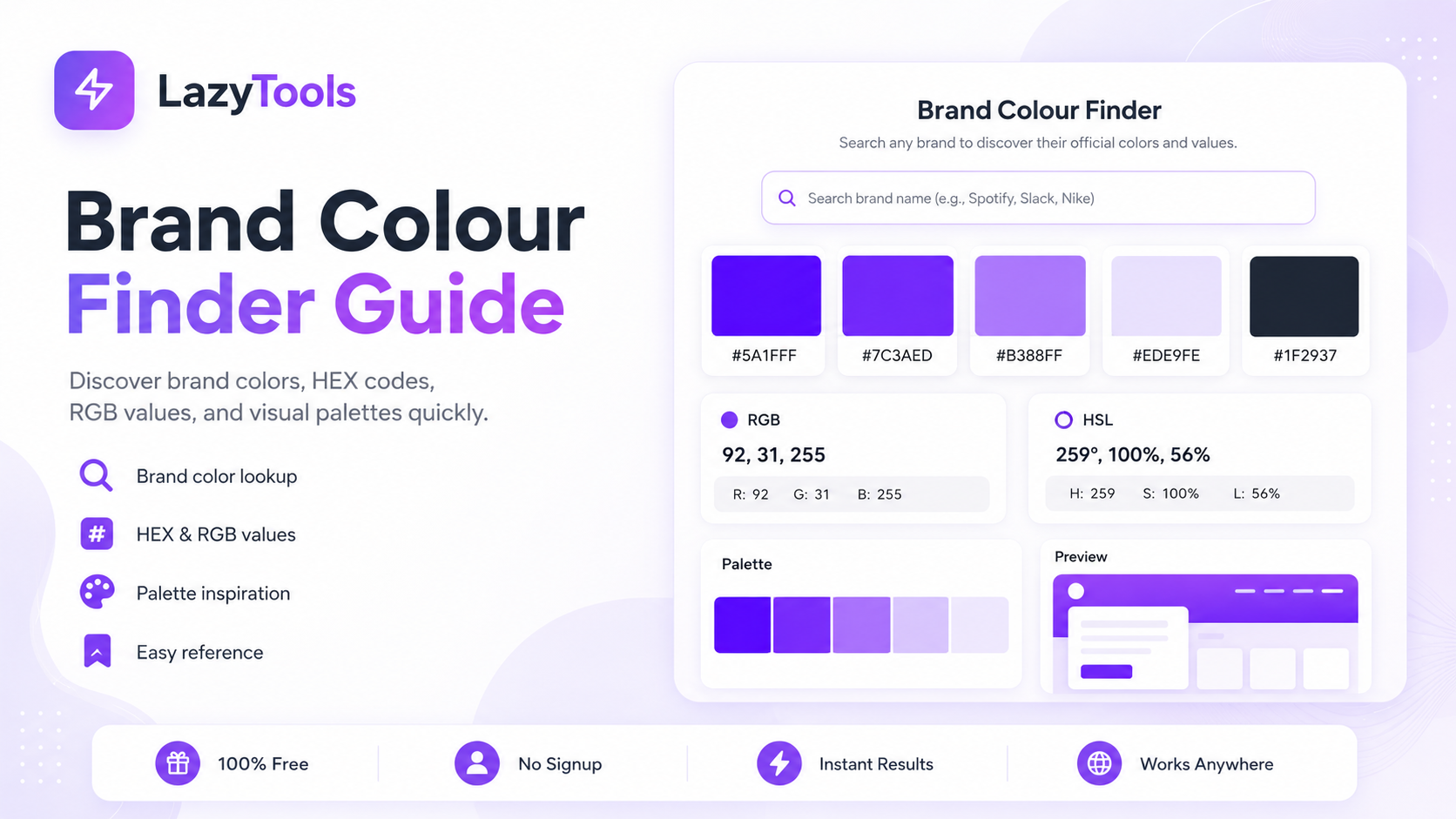
How to Find and Copy a Brand Colour in Four Clicks
🎨 Find Any Brand's Official Colours Now
700+ brands, 4 copy formats, usage notes — free, no login, no ads.
Popular Brand Primary Colours: Quick Reference
These are the most-searched brand colours in the database. Specifically, the HEX values listed here match the current official guidelines as of May 2026, reflecting 2023-2025 rebrands where applicable.
| Brand | Colour Name | HEX | Swatch | Category |
|---|---|---|---|---|
| Apple | Apple Off-Black | #1D1D1F | Tech | |
| Google Blue | #4285F4 | Tech | ||
| Meta | Meta Blue (2023) | #0866FF | Tech | |
| Spotify | Spotify Green | #1DB954 | Tech | |
| Netflix | Netflix Red | #E50914 | Media | |
| Nike | Nike Black | #111111 | Sport | |
| Coca-Cola | Coca-Cola Red | #F40009 | Food | |
| McDonald's | Golden Arches Yellow | #FFC72C | Food | |
| Emirates | Emirates Red | #D71920 | Travel | |
| Slack | Slack Aubergine | #4A154B | Tech | |
| Revolut | Revolut Near-Black | #191C1F | Finance | |
| Tata | Tata Blue | #003399 | Tech |
Why Brands Choose Their Colours: The Psychology Behind the Palette
Colour choices encode meaning before any text is read. Specifically, blue is the most used corporate colour because it conveys trust, stability and professionalism — which is why finance brands (Visa's #1A1F71, PayPal's #003087, American Express's #007BC1), tech giants (Meta, LinkedIn, Samsung) and airlines (British Airways, Singapore Airlines, Etihad) all default to blue. Furthermore, blue has the lowest cross-cultural negative associations of any colour, making it safe for global brands operating across diverse markets.
Red signals urgency, appetite and energy — consequently it dominates food brands (Coca-Cola, McDonald's, KFC, Heinz), streaming (Netflix, YouTube) and fast-fashion (H&M, Zara). Specifically, red increases heart rate and stimulates appetite, which is why virtually every major fast-food chain uses red or orange as its primary colour. Green signals nature, health and growth — WhatsApp (#25D366), Spotify (#1DB954), Whole Foods, and most sustainability-positioned brands use green to signal environmental or wellness values. Furthermore, green is the colour most associated with financial gain in Western cultures, which is why many fintech brands (Revolut's secondary green, Wise's #00B67A) use it alongside their primary identity.
🟡 Yellow and Orange: Accessibility and Energy
Yellow and orange signal warmth, optimism and accessibility — the language of Noon (#FEEE00), talabat (#FF6B00), DHL (#FFCC00), Snapchat and Amazon. Specifically, yellow is the most visible colour in peripheral vision, making it effective for brands that compete in crowded physical or digital environments where attention capture is critical. Furthermore, orange occupies the psychologically energetic midpoint between red's urgency and yellow's warmth — making it the colour of delivery, food ordering and same-day commerce platforms globally.
🟣 Purple: Premium, Creative and Non-Conformist
Purple historically signalled royalty and luxury because purple dye was extraordinarily expensive to produce before the synthetic era. Consequently, Cadbury uses deep purple to signal premium chocolate, Hallmark uses purple for greeting cards and gifting, and Twitch uses purple (#9146FF) to signal creative and entertainment culture. Slack's aubergine (#4A154B) is a deliberate non-conformist choice that differentiates it from the corporate blues of enterprise software competitors. Furthermore, neobanks like Revolut use violet gradients precisely because purple has no established meaning in banking — it signals disruption rather than conformity to the category.
UAE and Middle East Brand Colours: The Region's Most Distinctive Palettes
The UAE brand ecosystem includes some of the most distinctive colour identities in the world. Specifically, the region's brands reflect a mix of national colour traditions, Islamic design heritage, and the bold, high-visibility aesthetics of a fast-growing consumer market where brand recognition must break through crowded physical and digital environments.
🔴 Emirates: Red and Gold
Emirates uses a combination of Emirates Red (#D71920) and Emirates Gold (#A4863C). Specifically, the red references both the UAE national flag and the high-energy dynamism of the brand. The gold references luxury and premium service positioning, applied consistently across aircraft livery, cabin crew uniforms, First Class branding, and all marketing. Furthermore, the combination is one of the most recognisable in global aviation — the red tail with gold Arabic calligraphy has appeared across over 260 aircraft in the Emirates fleet, making it one of the most-viewed brand colour combinations in international travel.
🟠 talabat, Noon and Careem
talabat's orange (#FF6B00) is one of the most visible brand colours in Dubai and across the Gulf — consistent with the global food delivery category convention of warm, energetic colours that signal speed and appetite. Noon uses a distinctive bright yellow (#FEEE00) that makes it immediately recognisable as the Arab world's largest e-commerce platform, differentiating it from Amazon's warmer orange while maintaining the energy and accessibility signals of the yellow-orange spectrum. Careem's fresh green (#00C07F) uses the colour of growth and reliability to position it as a trustworthy mobility partner — notably similar in tone to Grab's green in Southeast Asia, suggesting a cross-market convergence on green for ride-hailing brands that want to signal reliability without the corporate formality of blue.
🇮🇳 India: Tata, Swiggy, Zomato and Flipkart
India's brand landscape features some of the most colour-saturated identities in the world, reflecting a market where visual vibrancy is expected and muted palettes risk invisibility. Tata's institutional blue (#003399) reflects its colonial-era establishment and cross-sector authority — a colour of institutional trust that has remained consistent across the conglomerate's 180+ companies. Swiggy's orange (#FC8019) and Zomato's red (#CB202D) follow the global food delivery convention while maintaining distinctiveness from each other. Flipkart's yellow (#F8CB2E) differentiates it from Amazon's presence in India while signalling the optimistic, accessible e-commerce positioning of a platform built for value-conscious consumers.
How to Use Brand Colours in CSS: HEX, HSL, RGB and CSS Custom Properties
A HEX code is used in CSS directly as a colour value: color: #E50914; or background-color: #E50914;. HEX codes are the most widely supported colour format across all browsers and design tools. Specifically, they can be converted to RGB (rgb(229, 9, 20)) or HSL (hsl(357, 92%, 47%)) which offer more readable and more manipulable values for design systems.
🎨 CSS Custom Properties for Brand Colour Systems
The CSS variable format — --brand-netflix: #E50914; — is the foundation of modern design token systems. Specifically, a CSS custom property stores a value that can be referenced throughout a stylesheet: any rule can use color: var(--brand-netflix);. If you later need to change the red across the entire project, you change it in one place. Furthermore, for design systems where the same brand colour is referenced across multiple components, CSS variables eliminate the risk of colour inconsistency from copying and pasting hex values. Consequently, the CSS variable copy format in the brand colour finder — which outputs --brand-netflix: #E50914 — is designed for direct pasting into a design token file or :root block.
🌈 HSL for Programmatic Tint and Shade Generation
HSL is more intuitive for designers than HEX or RGB because you can adjust a colour's shade by changing only the lightness value, without touching the hue. Specifically, hsl(239, 84%, 80%) is a lighter tint of LazyTools indigo while hsl(239, 84%, 40%) is a darker shade — the hue and saturation remain constant, making the relationship between the colours mathematically predictable. Furthermore, CSS custom properties combined with HSL channel variables is a popular modern design token approach: define --brand-hue: 239; and --brand-sat: 84%; separately, then compose colours using hsl(var(--brand-hue), var(--brand-sat), 67%). This approach lets you generate full tonal scales from a single brand colour definition.
Screen Colours vs Print Colours: Why Your Brand Hex Looks Different in Print
Screen colours (RGB and HEX) are produced by emitting light. Print colours (CMYK and Pantone) are produced by absorbing light through ink. Specifically, the two colour spaces have different gamuts — screens can reproduce highly saturated colours like Spotify Green (#1DB954) and Discord Blurple (#5865F2) that are difficult or impossible to match exactly with standard CMYK inks. Furthermore, the RGB-to-CMYK conversion that happens when you send a screen design to print always involves some gamut compression — colours are shifted to the nearest printable equivalent, which may be noticeably less vivid for highly saturated brand colours.
Pantone's Spot Colour system exists precisely to solve this problem. Specifically, a Pantone code like Pantone 185 C (Coca-Cola red) produces a consistent red on any press worldwide, independent of the paper stock or printer — because spot colour inks are pre-mixed to the exact specification rather than built from CMYK primaries. Furthermore, a complete brand style guide specifies colours in four formats: Pantone for print and physical materials, CMYK for process printing, RGB for digital display, and HEX for web and digital design. The HEX values in the LazyTools database correspond to the RGB specification from official guidelines — always verify against the brand's Pantone specification before commissioning physical print materials.
Five Brand Colour Mistakes That Undermine Design Quality
❌ Mistake 1: Using an Eyedropper on a JPEG Logo
JPEG compression introduces colour artefacts, particularly near edges and in flat colour areas. Specifically, eyedropping a hex code from a JPEG logo may return a value 3-8 points off from the correct RGB value in any channel — enough to produce a noticeably different colour when applied to large background areas. Furthermore, the artefact colour varies depending on where on the swatch you click the eyedropper. Consequently, always extract colours from SVG source files (which contain exact hex values in their markup) or from the official brand guidelines PDF, not from JPEG renderings.
❌ Mistake 2: Using an Outdated Brand Hex After a Rebrand
Major rebrands change specific hex values without changing the brand colour name. Specifically, Meta's blue changed from #1877F2 to #0866FF in 2023 — if your design tool has the old value cached in a library, you will be producing Meta brand assets with incorrect colours without any visual alert. Furthermore, Pepsi's blue refresh and Twitter's complete identity change are two more recent examples. Consequently, whenever starting a new project involving a major brand, verify the current hex values against the brand's official guidelines rather than relying on any cached or third-party source.
❌ Mistake 3: Ignoring Brand Colour Usage Restrictions
Brand guidelines specify not just the colours but the contexts in which each colour may be used. Specifically, Spotify explicitly prohibits Spotify Green (#1DB954) on white or light backgrounds — a restriction that exists both for accessibility (the contrast ratio fails WCAG AA) and brand identity reasons. Furthermore, many brands restrict certain colours to specific use cases: a secondary colour may be for accents only, not backgrounds; a gradient may only appear in specific orientations; a colour may be permitted on dark surfaces but not light ones. Consequently, always read the usage notes in the expanded brand card before applying a colour — especially for client-facing design work where brand compliance is expected.
❌ Mistake 4: Confusing the Logo Colour with the Brand Colour System
Multi-colour logos — like Google's four-colour mark, the Slack four-colour pinwheel, or the NBC peacock — contain colours that are used only in the logo and are explicitly not intended for use elsewhere in brand communications. Specifically, Slack's brand guidelines strongly warn against using the individual logo colours (blue, green, yellow, red) outside the logo mark — the only brand colour for general use is the Aubergine primary. Furthermore, Google's four logo colours are a diversity statement within the logo itself and are not the Google brand colours for UI design — Google Blue (#4285F4) is the UI primary, used separately from the rainbow logo. Consequently, always check whether a colour from a logo is part of the general brand colour system or restricted to the logo only.
❌ Mistake 5: Assuming Accessibility from Brand Colour Combinations
Brand colour combinations chosen for visual impact may not meet WCAG accessibility contrast requirements. Specifically, McDonald's Golden Arches Yellow (#FFC72C) on white achieves a contrast ratio of approximately 1.9:1 — well below the WCAG AA threshold of 4.5:1 for normal text. Consequently, design systems that use brand colours for text must verify contrast ratios for every colour combination and adjust the usage context accordingly — for example, using yellow for large display text only (where the 3:1 threshold applies) rather than body text. The LazyTools WCAG Contrast Checker tests any colour pair against all WCAG thresholds.
How AI Is Changing Brand Colour Discovery and Design System Management
Artificial intelligence is increasingly automating tasks that previously required manual colour extraction, palette generation and design system management. Specifically, several capabilities that were specialist skills are becoming accessible through AI tools in 2026.
🔍 AI Brand Colour Extraction from Images and Websites
AI-powered colour extraction tools including Google's colour prominence API, Adobe's Firefly colour extraction and specialist tools like Brandfetch's automated scraper can extract brand colour palettes from logos, website screenshots and brand assets without requiring manual eyedropper work. Specifically, these tools use computer vision models trained on millions of branded assets to identify the intentional brand colours rather than the incidental colours that might dominate a photograph or background. Furthermore, Brandfetch's API extracts colours, fonts and logo assets from a domain URL automatically — useful for agencies that need to work with large numbers of client brands. Consequently, manual hex code hunting from brand guidelines is increasingly being replaced by automated extraction for initial colour discovery, though the official database values remain the authoritative reference for client-facing work.
🎨 LLM-Assisted Design Token Generation
Large language models including GPT-4 and Claude can accept a set of brand hex codes and generate complete design token structures — CSS custom property definitions, Tailwind configuration objects, Figma token JSON and design system documentation. Specifically, a designer can provide the primary and secondary brand hex codes and receive a fully structured set of tonal scales (50 through 900), semantic tokens (primary, secondary, accent, surface, on-surface) and component-level tokens (button-background, button-hover, button-disabled) in the format required by their design system. Furthermore, LLMs can check the generated token set for WCAG compliance and suggest adjusted lightness values for tokens that fail accessibility requirements. Consequently, the design token generation workflow that previously required hours of manual colour calculation is being compressed to minutes through LLM assistance.
🤖 AI in Brand Guideline Monitoring
Several brand management platforms including Frontify, Bynder and Brandfolder are integrating AI to monitor brand colour usage across digital assets. Specifically, these systems can scan a library of digital files and flag any use of colours outside the approved brand palette — a capability that previously required manual review. Furthermore, some platforms now use AI to automatically update brand colour tokens across a design system when the brand guidelines are officially updated, propagating the change to all connected assets rather than requiring manual find-and-replace. Consequently, the brand colour consistency problem — ensuring that all designers across an organisation use exactly the same hex values — is increasingly being addressed through automated monitoring and propagation rather than style guide documentation alone.
LazyTools vs Other Brand Colour Finders
Scroll to see all columns →
| Feature | LazyTools | brandfetch.com | brandcolors.net | uicolors.app |
|---|---|---|---|---|
| Brand count | 700+ | Millions (API) | ~600 | ~300 |
| Copy HEX instantly | ✅ | ✅ | ✅ | ✅ |
| Copy RGB and HSL | ✅ | ✅ | ✘ | ✅ |
| Copy CSS variable | ✅ | ✘ | ✘ | ✘ |
| Usage notes per colour | ✅ | ✘ | ✘ | ✘ |
| Regional brands (UAE, India, SEA) | ✅ | Partial | ✘ | ✘ |
| No login required | ✅ Always | API requires key | ✅ | ✅ |
| No ads | ✅ | ✅ | ⚠️ Ads shown | ✅ |
| Updated for 2023-25 rebrands | ✅ | ✅ Auto | Partially | Partially |
Brand Colour Questions Answered Directly
How do I find a brand's official hex code?
The most reliable sources are the brand's official press kit, brand guidelines PDF, brand.companyname.com subdomain, or developer documentation. Specifically, many brands publish SVG logo files that contain the exact hex values in their source code — open the SVG in a text editor and read the fill and stroke attributes directly. Furthermore, for any of the 700+ brands in the LazyTools database, the official values are compiled here and updated for recent rebrands, making it the fastest single-source reference for the most commonly needed brands.
What is the Google brand colour palette?
Google uses four colours from its logo: Google Blue (#4285F4), Google Red (#EA4335), Google Yellow (#FBBC05) and Google Green (#34A853). Specifically, these four colours appear together as a system representing diversity — they rarely appear individually in Google corporate branding. Furthermore, the same four colours form the foundation of the Material Design colour system used across Android, Google Workspace and all Google products. Each hue has a full tonal palette from 50 to 900 within Material Design.
Why does Slack use aubergine as its primary brand colour?
Slack's primary brand colour is Aubergine (#4A154B) — a deep, slightly warm purple. The choice was intentional in differentiating Slack from the dominant blues in enterprise software (Salesforce, Microsoft Teams, Zoom, LinkedIn). Specifically, aubergine creates a warmer, more human feeling appropriate for a communication platform, while still feeling serious enough for professional contexts. Furthermore, Slack's brand guidelines strongly warn against using the individual logo colours (blue, green, yellow, red) outside the logo mark — the Aubergine is the only brand colour to use independently.
What does Revolut's colour say about neobanks?
Revolut's near-black (#191C1F) primary with violet gradient (#7B61FF) represents a deliberate rejection of the traditional banking palette. Specifically, legacy banks use deep navy or corporate blue to signal trust and stability. Neobanks like Revolut, Monzo (coral pink #FF3464), N26 and Wise (#00B67A) have collectively avoided blue to signal that they are fundamentally different from traditional banks. Revolut's dark-first identity also reflects its digital-native design philosophy — the app is designed for dark mode first.
Authoritative Sources for Brand Colour Guidelines
🏢 Official Brand Guideline Sources
- Apple Brand Guidelines — Official Apple colour, typography and logo usage guidelines
- Google Brand Resource Center — Official Google brand guidelines including the four-colour system and Material Design tokens
- Spotify Brand Guidelines — Official guidelines including the green-on-white prohibition and dark-background requirements
🎨 Design System and Colour References
- Material Design 3 Colour System — Google's complete tonal colour system built on the four Google brand colours
- WCAG 2.1 Contrast Requirements — The 4.5:1 AA standard that determines whether brand colour combinations are accessibility-compliant
- Pantone Colour Systems — Official Pantone guidance on converting between Pantone, CMYK, RGB and HEX for print and screen
⚖️ Brand Colour Law and Trademarks
- EUIPO Trade Mark Law — EU trademark law covering single-colour trademarks (relevant to Cadbury, T-Mobile, Louboutin cases)
- UK Intellectual Property Office — UK trade mark guidance including colour marks and the acquired distinctiveness doctrine
- Brandfetch API — Developer API for automated brand asset extraction including colour palettes from domain URLs
Frequently Asked Questions About Brand Colours
Formats and Usage
Specific Brand Questions
The Future of Brand Colours: P3, HDR and Design Tokens
Brand colour systems are entering a period of significant technical expansion driven by new display capabilities and evolving CSS standards. Specifically, three trends are reshaping how brand colours are specified, stored and rendered in 2026.
🌈 Wide-Colour Gamut P3 Brand Colours
The Display P3 colour space — supported by every iPhone since 2016, every Mac since 2017, and most modern OLED displays — can reproduce colours approximately 25% more saturated than the standard sRGB space used for traditional web hex codes. Specifically, brands that have historically specified their most vivid colours in sRGB (which truncates saturation for highly chromatic brand colours) are beginning to specify Display P3 equivalents that can be rendered with full vibrancy on capable screens. Furthermore, CSS Color Level 4 introduces the color(display-p3 r g b) syntax that allows web designers to specify P3 colours natively — so a brand can say "use this sRGB hex on non-P3 screens and this P3 value on capable screens." Consequently, brand colour databases will increasingly need to specify both sRGB HEX and P3 values for vivid brand colours where the difference is perceptible.
🎨 Design Tokens as the Universal Brand Colour Layer
The W3C Design Tokens Community Group is finalising a standard JSON format for design tokens — including colour tokens — that allows a single source of truth to propagate colour values to Figma, CSS, iOS, Android, React Native and other targets simultaneously. Specifically, this standard means a brand can define its colours once in a token file and automatically generate correctly formatted colour values for every platform without manual conversion. Furthermore, tools including Tokens Studio for Figma, Style Dictionary and Theo already implement precursor versions of this standard. Consequently, the future of brand colour management is moving away from copy-pasting hex codes and toward automated token propagation — a shift that makes the initial hex reference (which this tool provides) the seed value for a fully automated colour system, rather than a frequently-repeated manual lookup.
🤖 AI-Generated Brand Colour Systems
Generative AI tools are beginning to create complete brand colour systems from minimal inputs. Specifically, tools including Adobe Firefly's brand generation mode, Looka and Brandmark can generate a full brand colour palette — primary, secondary, accent, surface and semantic colours — from a business description and mood keywords. Furthermore, these AI systems use training data from thousands of professional brand guidelines to generate palettes that follow established colour harmony rules and accessibility requirements automatically. Consequently, the traditional process of developing a brand colour system through multiple rounds of designer iteration is being compressed for smaller brands and startups — though the official hex code reference that established brands publish remains the authoritative source for any work involving existing brands.