
explainer
Brand Colors: The Exact Hex Codes of Famous Brands, and How to Use Them Legally
By Uttam Regmi · Published 2026-07-10 · Updated 2026-07-10 · 7 min read · Fact-checked, sources cited
Netflix red is #e50914, Spotify green is #1db954, Tiffany blue is about #0abab5, and here’s
the part that surprises people: you’re almost always free to use them. A color by itself isn’t
owned; what trademark law protects is using a brand’s identity to confuse customers. Look up any
of 1,100+ brand palettes, by name or by reverse-searching a hex code, in the
Brand Color Finder, and read on for where the legal line actually falls.
Where to get the exact codes
Designers reach for brand colors constantly, matching an embed to a platform’s UI, building a competitor mood board, recreating a look for study. The frustration is that the “official” hex code is scattered across brand guideline PDFs, press kits and half-remembered forum posts. The Brand Color Finder collects 1,100+ palettes in one searchable place, covering tech, finance, retail, food and drink, fashion, gaming, sport and more:
| Brand | Primary hex | Notes |
|---|---|---|
| Netflix | #e50914 | plus near-black #221f1f |
| Spotify | #1db954 | on black #191414 |
| Coca-Cola | #f40009 | the single most recognized red |
| Tiffany & Co. | #0abab5 | ”robin’s-egg blue”, a rare protected color |
#4285f4 | four-color palette (blue/red/yellow/green) | |
| Slack | #4a154b | aubergine + four accents |
Search by name (partial matching, “spoti” finds Spotify), or reverse-search by hex: type
#e50914 and it surfaces Netflix. Click any swatch to copy the code. It all runs in your browser, nothing you look up is logged.
A hex code is only one way to name a color, and the format you need depends on where the color is going: CSS and design apps want hex, print workflows lean on CMYK, and accessibility or theming work is easier in HSL. Drop any brand value into the Color Converter to see the same color across formats:
| Format | Netflix red | Best for |
|---|---|---|
| Hex | #e50914 | CSS, HTML, most design tools |
| RGB | rgb(229, 9, 20) | canvas, image editing, code |
| HSL | hsl(357, 92%, 47%) | tweaking lightness/saturation, theming |
RGB and HSL above are the exact algebraic conversions of #e50914, so they describe the identical
color, only the notation changes. (CMYK is the one exception: there’s no single “correct” CMYK for a
screen color because it depends on the printer and paper, which is exactly why on-brand print work
starts from the brand’s own spec, not a web hex.)
The legal question everyone actually has
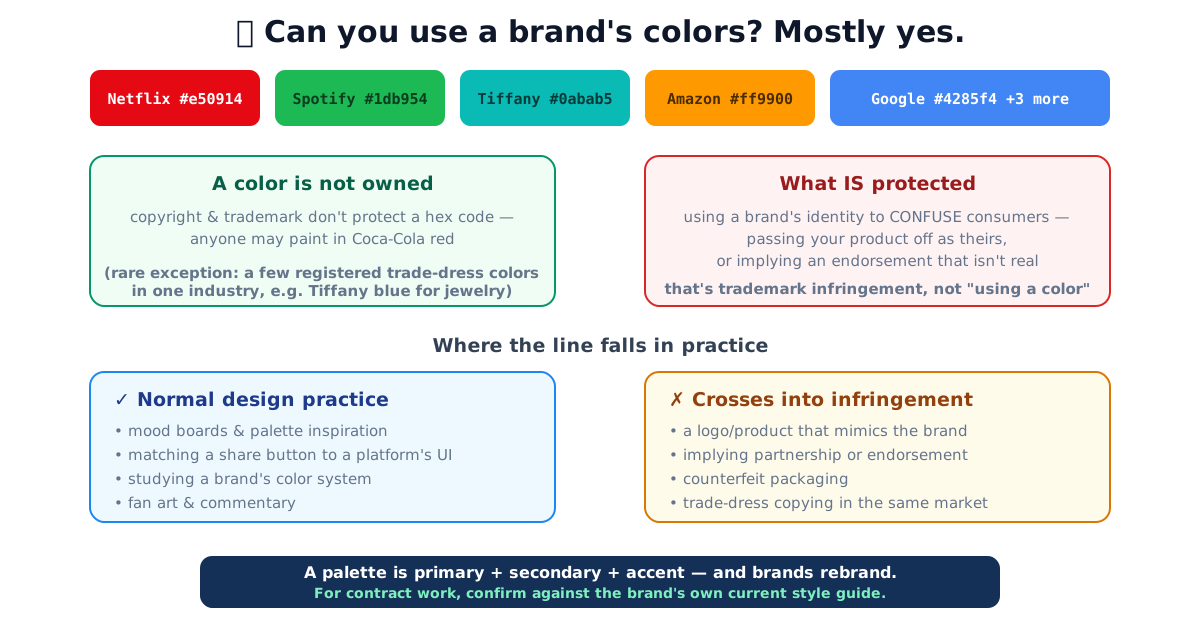
“Can I use Coca-Cola red?” The short answer is yes, the color, and it helps to see why. Two different bodies of law are often confused here:
- Copyright protects creative works, a photograph, a piece of music, a written article. It has never protected a color; a hue is not an authored work.
- Trademark protects the identifiers that tell consumers who made something, names, logos, and occasionally a specific color used as branding. The U.S. Supreme Court confirmed in Qualitex v. Jacobson (1995) that a color can function as a trademark, but only a specific color, for a specific product, that the public has come to associate with one source (Qualitex’s green-gold dry-cleaning press pads). Famous examples: Tiffany’s blue for jewelry packaging, UPS brown for delivery, T-Mobile magenta for telecoms.
Crucially, even a protected trade-dress color only stops uses that cause consumer confusion in
that market. Tiffany’s blue doesn’t stop you painting a wall, designing an unrelated app, or using
#0abab5 in a data chart. What it stops is a rival jeweller packaging rings in that blue to trade on
Tiffany’s reputation.
The practical line: confusion, not color
Since the test is confusion, the everyday rule is simple:
Normal, fine, done every day:
- Building a mood board or palette study from brands you admire
- Matching a “Share on X” button to X’s brand color, or an embed to a platform’s UI
- Fan art, commentary, reviews, comparison articles
- Learning from how a brand’s color system is constructed
Where it turns into a trademark problem:
- Designing a logo or product that mimics a brand’s look to ride its recognition
- Implying a partnership or endorsement that doesn’t exist
- Counterfeit packaging or trade-dress copying in the same market
- Using the brand’s colors and name/logo to suggest your thing is their thing
Notice that in every “problem” case, the issue isn’t the hex code, it’s the impersonation. Having
#e50914 in your CSS is not a Netflix problem; building “Netflox” with Netflix’s red, wordmark and
layout is.
The short list of colors that really are protected
Registered color trademarks are rare, and each one is tied to a specific product category. A color trademark for insulation says nothing about your app, your poster, or your website. A handful of the best-documented examples:
| Color | Owner | Product category |
|---|---|---|
| Robin’s-egg blue | Tiffany & Co. | jewelry boxes and bags |
| Brown (“Pullman Brown”) | UPS | delivery vehicles and uniforms |
| Magenta | Deutsche Telekom / T-Mobile | telecommunications |
| Green-gold | Qualitex | dry-cleaning press pads |
| Red lacquered sole | Christian Louboutin | high-fashion footwear |
| Pink | Owens Corning | fiberglass building insulation |
The pattern is the point. Louboutin’s red sole was upheld as a valid trademark, but a U.S. appeals court narrowed it in its 2012 dispute with Yves Saint Laurent: the protection covers a red sole that contrasts with the rest of the shoe, not an all-red shoe. Even the strongest color marks are hemmed in tightly. Outside that narrow lane, the same hue is free.
Worked example: matching a button without breaking it
Say you’re adding a “Continue with Spotify” button and want it on-brand. You grab Spotify green
#1db954 and set white text on it. Before shipping, run the pair through the
Contrast Checker, which scores color pairs against the WCAG guidelines
used across the web. Those guidelines ask for a contrast ratio of at least 4.5:1 for normal-size
text and 3:1 for large or bold text (roughly 18pt and up).
White text on a mid-tone green like #1db954 tends to land in a gray zone, comfortable for large
button labels, but marginal for small print. The fix is the same one Spotify itself uses: pair the
green with near-black text or reserve white for larger, bolder labels. This is why grabbing a single
brand hex and dropping it into your UI can quietly fail accessibility: the brand color was designed
to sit inside a full system of foreground and background tones, not to carry every job alone. Check
the pairing, don’t assume it.
Colors are a palette, and palettes change
Two last practical notes the Brand Color Finder is built around. First, a brand color is usually a system: a primary plus secondaries and accents. Using only the primary can look “off” precisely because the real identity carries supporting tones, which is why each entry shows the whole palette, primary first.
Second, brands rebrand. Logo and palette refreshes happen constantly, so a documented hex is a strong starting point, not a permanent fact. For inspiration and matching, the finder’s values are ideal. For contract, print, or anything where being exactly on-brand is contractual, pull the brand’s own current style guide as the source of truth, and if you spot a value that’s gone stale, the tool has a corrections link.
Quick summary
The exact codes exist and are easy to look up, Netflix #e50914, Spotify #1db954, and 1,100+
more in the Brand Color Finder, searchable by name or reverse hex. The legal
worry is mostly misplaced: a color isn’t owned, and even the rare protected trade-dress colors only
stop consumer confusion in their own market. Use brand palettes freely for inspiration, study and UI
matching; don’t use them to impersonate. And remember the palette is a system that brands revise, verify against the official guide when exactly on-brand actually matters.
Sources: Qualitex Co. v. Jacobson Products Co. (U.S. Supreme Court, 1995) · USPTO, Trademark basics · Wikipedia, Colour trade mark. This article is general information, not legal advice; consult a qualified attorney for specific situations.
Frequently asked questions
What is the exact hex code for Netflix red / Spotify green / Tiffany blue?
Netflix red is #e50914, Spotify green is #1db954, and Tiffany blue is approximately #0abab5. These come from the brands' documented guidelines and long-standing community references. The Brand Color Finder holds 1,100+ such palettes, searchable by name or by hex.
Are brand colors copyrighted or trademarked?
A color by itself is generally not protected, copyright covers creative works, not hues, and you can't trademark 'red'. What trademark law can protect, narrowly, is a specific color used as brand identity in one market (trade dress), like Tiffany's robin's-egg blue for jewelry boxes or UPS brown for delivery. Even then, the protection is against consumer confusion, not against anyone ever using that hue.
Can I legally use a brand's colors in my own project?
For inspiration, mood boards, study, fan art, or matching a share button to a platform's UI, yes, that's normal design practice. What you can't do is use a brand's colors together with its name, logo or look to make people think your product is theirs, or that they endorse you. The line is consumer confusion, not the color itself.
Why does a brand have several colors?
Most identity systems are a palette, not a single color: a primary (the one people mean by 'the brand color') plus secondary and accent colors. Google has four, Slack five, Instagram a gradient. The Brand Color Finder shows the full palette with the primary first.
Are these the official, current brand colors?
They're the widely documented values from brand guidelines and press kits, reliable and stable for well-known brands. But brands rebrand (think of the many logo refreshes each year), so for contract or print work, always confirm against the brand's own current style guide.
How do I find which brand uses a specific color?
Reverse-search by hex: type a code like #ff0000 (or a fragment) into the Brand Color Finder and it lists every brand whose palette starts with that value, a quick way to answer 'who uses this exact red?'