
explainer
Accessible Color: Contrast Ratios and Color Blindness, Explained
By Uttam Regmi · Published 2026-07-11 · Updated 2026-08-23 · 6 min read · Fact-checked, sources cited
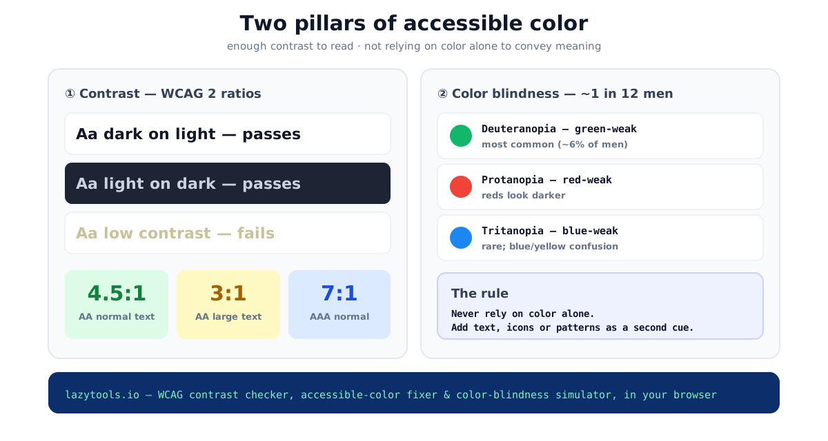
Accessible color comes down to two questions: can people read it, and does it still make sense without color? The first is contrast, WCAG Level AA needs a ratio of 4.5:1 for normal text and 3:1 for large text. The second is color blindness, about 1 in 12 men can’t reliably tell certain colors apart, so color must never be the only signal.
The two pillars
Pillar 1, contrast
Contrast is a ratio between the relative luminance of the text and its background, from 1:1
(identical, invisible) to 21:1 (black on white). The WCAG 2 guidelines set the thresholds:
| Level | Normal text | Large text (≥18.66px bold / ≥24px) |
|---|---|---|
| AA | 4.5:1 | 3:1 |
| AAA | 7:1 | 4.5:1 |
AA is the level referenced by most accessibility law and policy, the European Accessibility Act, the ADA, and Section 508 all point at WCAG 2 Level AA. Check any pair with the contrast checker; check a whole palette at once with the contrast grid.
How the ratio is actually computed
The number is not a guess. It comes from relative luminance, a weighted measure of how much light a
color emits. Each of the sRGB channels is normalized to 0-1, linearized to undo gamma encoding, then
combined as L = 0.2126·R + 0.7152·G + 0.0722·B. The green weight is the largest because the eye is most
sensitive to green. The contrast ratio between two colors is then:
(L_lighter + 0.05) / (L_darker + 0.05)The 0.05 term models ambient light reflecting off the screen, which is why the scale tops out at 21:1
rather than infinity even for pure black on pure white.
A worked example. Take a medium gray #767676 on a white background. White has a luminance of 1.0.
The gray works out to a luminance of about 0.18, so the ratio is (1.0 + 0.05) / (0.18 + 0.05) ≈ 4.54:1.
That clears 4.5:1 for normal text, barely. Lighten the gray one more step to #808080 and it drops below
4.5:1 and fails. This is why “it looks fine to me” is unreliable: a single step in lightness can move a
color across the threshold, and the difference is invisible on a good monitor in a dark room.
Beyond text: non-text contrast
Contrast is not only about letters. WCAG 2.1 added success criterion 1.4.11 Non-text Contrast, which requires a 3:1 ratio for the parts of a UI you need to see to operate, button outlines, form-field borders, toggle states, focus rings, and for the meaningful parts of graphics like chart lines. A pale gray input border on a white card may look elegant but fails this rule, leaving low-vision users unable to find the field. When you audit a screen, check icons and controls, not just body copy.
Fixing a color that fails
The trick is to change only lightness and keep the hue, so the color still reads as “the same color”, just legible. Darken text on a light background (or lighten it on a dark one) until the ratio crosses your target. The accessible-color generator does this search for you, enter the foreground, background and target, and it returns the nearest passing color, lighter and darker.
Pillar 2, color blindness
Contrast fixes legibility, but a perfectly high-contrast red and green can still be indistinguishable to a color-blind user. Color-vision deficiency affects about 8% of men (and far fewer women), in three main forms:
- Deuteranopia, green-weak, the most common. Reds, greens, browns and oranges blur together.
- Protanopia, red-weak. Similar red-green confusion, and reds appear darker, so red-on-dark text can nearly vanish.
- Tritanopia, blue-weak, rare. Blues and greens, and yellows and pinks, become hard to separate.
Each dichromacy has a milder “anomalous” cousin, deuteranomaly, protanomaly, tritanomaly, where the cone is present but shifted rather than missing. Anomalous forms are more common than full dichromacy but cause the same category of confusion, just less severely.
| Type | Cone affected | Confuses | Prevalence |
|---|---|---|---|
| Deuteranopia / -anomaly | Green (M) | Red ↔ green, brown ↔ orange | Most common |
| Protanopia / -anomaly | Red (L) | Red ↔ green; reds look darker | Common |
| Tritanopia / -anomaly | Blue (S) | Blue ↔ green, yellow ↔ pink | Rare |
| Achromatopsia | All / none | Everything (sees only lightness) | Very rare |
The two red-green types together account for the large majority of color-vision deficiency, which is why the red/green pairing, used everywhere for pass/fail, buy/sell, and up/down, is the single riskiest design choice.
The way to catch problems is to simulate your interface under each type and look for two colors that collapse into the same appearance. The color blindness simulator does this for an uploaded screenshot or a pasted palette (the design-system case), entirely on your device.
The one rule
Never rely on color alone to convey information.
If red means “error” and green means “ok”, add a symbol (✕ / ✓), a label, or a shape. Charts should use patterns or direct labels, not just a color legend. Do that, and the design works for everyone, color-blind or not, on a cheap display or in bright sunlight.
A practical workflow
You do not need to redesign around accessibility; you fold a few checks into the work you already do:
- Set your text pairs first. Pick body and heading colors against their real backgrounds and confirm each clears its target, 4.5:1 for normal, 3:1 for large. Do this before you commit to a palette, not after, because retrofitting contrast usually means changing brand colors.
- Check the controls, not just the copy. Run button borders, input outlines, and focus rings against the 3:1 non-text bar so keyboard users can see where they are.
- Simulate the whole screen. View a real screenshot under deuteranopia and protanopia and hunt for two colors that merge, the classic failure is a status chip where “paid” and “overdue” become the same swatch.
- Add the redundant cue. Anywhere color carries meaning, attach an icon, label, or shape so the signal survives when the color does not.
- Re-run after every palette change. A single tweak to a brand color can quietly break a pair you already passed.
This order matters: contrast is a hard numeric gate you can automate, while the color-alone rule is a judgment call you make per component. Automate the first, review the second.
WCAG 2 vs APCA
You may see a newer method called APCA (Accessible Perceptual Contrast Algorithm), proposed for the
draft WCAG 3. Instead of a ratio it reports a lightness-contrast value (Lc) and accounts for polarity
and font size, often a more realistic readability signal. It is worth checking with the
APCA contrast checker, but WCAG 2 remains the standard referenced by
law today, so use it for compliance and treat APCA as a forward-looking second opinion.
Quick summary
Accessible color needs enough contrast, WCAG AA is 4.5:1 for text, 3:1 for large text, and must not depend on color alone, because roughly 1 in 12 men have color-vision deficiency (most often green-weak deuteranopia). Fix failing colors by adjusting lightness while keeping the hue, simulate your palette under each deficiency, and always add a non-color cue. Start with the accessible-color generator and the color blindness simulator.
Sources: WCAG 2.2 (W3C) success criteria 1.4.3 and 1.4.11; Machado, Oliveira & Fernandes (2009) CVD model; APCA / WCAG 3 working draft. Educational information, not a formal accessibility audit.
Frequently asked questions
What contrast ratio do I need for accessibility?
WCAG 2 Level AA requires a contrast ratio of at least 4.5:1 for normal text and 3:1 for large text (≥18.66px bold or ≥24px regular). Level AAA requires 7:1 for normal text and 4.5:1 for large. The ratio ranges from 1:1 (identical) to 21:1 (black on white).
How do I fix a color that fails contrast?
Keep the hue and adjust the lightness until the ratio meets the target, usually you darken text on a light background or lighten it on a dark one. An accessible-color tool binary-searches the lightness for you and returns the nearest passing color, so it stays on-brand.
How common is color blindness?
About 1 in 12 men (roughly 8%) and 1 in 200 women have some form of color-vision deficiency. The most common is deuteranopia/deuteranomaly (green-weak); protanopia (red-weak) and tritanopia (blue-weak) are less common.
What does designing for color blindness mean in practice?
Never rely on color alone to convey meaning. If red means error and green means success, also add an icon, text label or shape, otherwise a red-green color-blind user cannot tell them apart. Simulating your UI under each deficiency reveals where two colors collapse into one.
What is the difference between deuteranopia, protanopia and tritanopia?
They are the three dichromacies: deuteranopia is missing green-sensitive cones (green-weak, most common), protanopia is missing red-sensitive cones (red-weak, reds look darker), and tritanopia is missing blue-sensitive cones (blue-weak, rare). The first two cause red-green confusion; tritanopia causes blue-yellow confusion.
Is WCAG contrast the same as APCA?
No. WCAG 2 uses a contrast ratio (1-21) that is the current legal standard. APCA is a newer, perceptually-based method proposed for WCAG 3 that reports a lightness-contrast value (Lc) and accounts for polarity and font size. Many teams check both, but WCAG 2 is what compliance references today.