
explainer
WCAG Color Contrast Explained: The 4.5:1 Rule Without the Jargon
By Uttam Regmi · Published 2026-07-05 · Updated 2026-07-05 · 6 min read · Fact-checked, sources cited
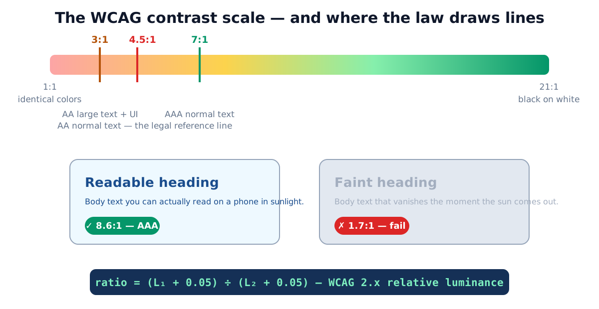
WCAG requires a contrast ratio of at least 4.5:1 between normal text and its background (Level AA), 3:1 for large text and UI components, 7:1 for the stricter AAA level. These are the numbers behind accessibility law, and checking any pair takes seconds in the contrast checker, which computes the official formula live.
What the ratio measures
Contrast compares how bright two colors appear, not how different they look. Each color gets a relative luminance, a 0-to-1 brightness value computed from its RGB channels, weighted the way human vision weights them (green counts most: L = 0.2126R + 0.7152G + 0.0722B, on linearized values). The ratio is then:
ratio = (L_lighter + 0.05) ÷ (L_darker + 0.05)
That yields 1:1 for identical colors and 21:1 for black on white. The + 0.05 term models a small
amount of ambient screen glare, so even two near-black colors never divide down to a wildly high
ratio. Hue barely matters, a saturated red and a saturated blue can have terrible contrast with
each other if their brightness is similar, which is why “it looks colorful” is not the same as
“it’s readable.”
The channels are linearized before weighting: each sRGB value (0-1) below 0.03928 is divided by
12.92, and everything above is raised through ((v + 0.055) ÷ 1.055) ^ 2.4. That step undoes the
gamma curve your monitor applies, so the luminance reflects real emitted light rather than the stored
pixel value. You never have to do this by hand, the contrast checker runs
the exact WCAG formula on every keystroke, but knowing the mechanism explains the results that feel
counter-intuitive, like a “bright” yellow (#ffd400) landing near 1.4:1 on white while a “dark”
navy clears 12:1.
The thresholds, precisely
| Requirement | Ratio | Applies to |
|---|---|---|
| AA, normal text | 4.5:1 | body copy, labels, links under 24px |
| AA, large text | 3:1 | ≥24px, or ≥18.66px bold |
| AA, UI & graphics (WCAG 2.1) | 3:1 | input borders, icons, focus indicators, chart elements |
| AAA, normal text | 7:1 | enhanced level |
| AAA, large text | 4.5:1 | enhanced level |
| Exempt | , | logos, decorative text, disabled controls |
Why it has legal weight: the European Accessibility Act, applying to e-commerce, banking and other services since June 2025, requires conformance with EN 301 549, which incorporates WCAG 2.1 Level AA. In the US, ADA web lawsuits and Section 508 procurement likewise use WCAG as the yardstick. AA is the line to clear; AAA is credit, not obligation.
Checking your colors: the 2-minute workflow
- Open the contrast checker and enter your text and background colors (HEX, RGB or the picker).
- Read the ratio and the four pass/fail verdicts (AA/AAA × normal/large).
- Test the real pairs from your UI: body-on-background, link-on-background, button-label-on-button, placeholder-on-input. The last two are where most sites fail.
- Don’t forget states: hover, focus and error colors need to pass too.
Worked example: this site’s bright brand blue #1d87f1 on white scores 3.46:1, passes for
large headlines, fails for body text. The fix wasn’t changing the brand: buttons and links use the
darker #166fde/#185ab4 shades of the same hue, which clear 4.5:1. That exact pattern, bright for
graphics, darkened for text, solves most “brand color fails” cases.
Reading the four verdicts
A checker returns four results because “pass” depends on both the level and the text size. The same pair can pass three tests and fail the one that matters for your body copy, so read all four rather than the headline number:
| Ratio | AA normal (4.5:1) | AA large (3:1) | AAA normal (7:1) | AAA large (4.5:1) |
|---|---|---|---|---|
| 2.8:1 | fail | fail | fail | fail |
| 3.5:1 | fail | pass | fail | fail |
| 4.6:1 | pass | pass | fail | pass |
| 7.2:1 | pass | pass | pass | pass |
The practical takeaway: a 4.6:1 pair is fine for a headline and body text at AA, but if you promised AAA on small labels you still fall short. Decide your target level once, then hold every real pair to it.
How dark does gray need to be?
Gray-on-white is where most contrast failures hide, so it helps to memorise a few anchor points. All values below are measured against pure white (#ffffff):
| Text color on white | Ratio | Verdict |
|---|---|---|
#000000 (black) | 21:1 | passes everything |
#767676 | 4.54:1 | lightest gray that passes AA normal text |
#949494 | ~3.0:1 | large text / UI only, fails AA body text |
#999999 | 2.85:1 | fails all text thresholds |
#cccccc | ~1.6:1 | decorative only |
So #767676 is the effective floor for small gray text on a white page. Anything lighter, the popular
#999 placeholder gray included, reads fine on your monitor but fails the standard the moment the
page meets sunlight, a cheap panel, or an older reader. When you need it lighter than #767676 for
visual hierarchy, size the text up to the large-text threshold instead, where 3:1 is the bar.
Fixing failures without redesigning
- Darken, don’t abandon. Generate the ramp of your color in the shades generator and test shades until one clears 4.5:1, the hue stays recognizably yours.
- Grays are the usual suspects. Placeholder and helper text at #999 (2.8:1) fails; #767676 is about the lightest passing gray on white.
- Size up instead. Text at ≥24px (or 18.66px bold) only needs 3:1, sometimes the fix is typography, not color.
- Check both themes. A pair passing in light mode can fail inverted in dark mode; ratios don’t transfer automatically.
Common contrast mistakes
- Testing only body text, buttons, placeholders, focus rings and informative icons have requirements too (3:1 as UI components).
- Judging by eye on a good monitor, your calibrated screen in a dim office is the best case; the standard exists for sunlight, cheap panels and aging eyes.
- White text on bright accents, the classic near-miss (white on this site’s bright blue: 3.46:1); darken the accent one step.
- Forgetting text over images/gradients, measure against the lightest area the text can sit on, or add a scrim.
- Chasing AAA everywhere, 7:1 constrains palettes hard; AA everywhere beats AAA somewhere.
Quick summary
Normal text needs 4.5:1, large text and UI need 3:1, AAA asks 7:1, measured as the luminance ratio between foreground and background on a 1-to-21 scale. The AA level carries legal weight via the EU Accessibility Act and WCAG-based rulings elsewhere. Check every real color pair in the contrast checker, and fix failures by darkening your hue’s shade, not by abandoning your brand.
Related tools: shades & tints generator · color converter · HEX to RGB. Formula and thresholds are from WCAG 2.1 (W3C Recommendation), the checker implements them exactly.
Frequently asked questions
What contrast ratio does WCAG require?
Level AA: 4.5:1 for normal text, 3:1 for large text (≥24px, or ≥18.66px bold) and for UI components/graphics (WCAG 2.1). Level AAA raises text thresholds to 7:1 and 4.5:1. AA is the level regulations reference.
Is WCAG contrast legally required?
Increasingly, yes: the European Accessibility Act (applying to many services since June 2025) references EN 301 549, which incorporates WCAG 2.1 AA; US ADA web cases and Section 508 also point at WCAG. For private sites it is at minimum the standard courts and regulators use as the benchmark.
What does a ratio like 4.5:1 actually mean?
It compares the relative luminance (perceived brightness) of two colors: (lighter + 0.05) ÷ (darker + 0.05). The scale runs 1:1 (identical colors) to 21:1 (pure black on pure white).
What counts as large text?
At least 18pt (24px), or 14pt (18.66px) if bold. Bigger glyphs stay legible at lower contrast, so the requirement relaxes to 3:1.
Do logos and placeholder icons need to pass?
Logos and purely decorative text are exempt. Placeholder text, disabled-state text and icons that convey information are commonly missed, informative icons need 3:1 as UI graphics.
My brand color fails on white, do I have to change the brand?
No, keep the bright color for graphics and large headlines (3:1 often passes) and use a darker shade of the same hue for body text and small labels. A shades generator gives you the candidates; the checker confirms.
Is gray text on white ever okay?
Light grays fail fast: #999 on white is 2.8:1. The darkest 'still feels gray' passing choices are around #767676 (4.54:1) for normal text.