
explainer
Which Chart Type Should You Use? A Decision Guide (Bar, Line, Pie, Funnel, Radar, Waterfall)
By Uttam Regmi · Published 2026-07-17 · Updated 2026-07-17 · 7 min read · Fact-checked, sources cited
Pick the chart from the question you’re answering, not from the data you happen to have. Comparing separate categories? Bar chart. Showing change over time? Line chart. Showing slices of one total? Pie chart. If none of those fit, the answer is usually a funnel (conversion stages), a radar (multi-attribute profile) or a waterfall (how a starting number became an ending number). When genuinely unsure, use a bar chart, it’s the most versatile and the easiest to read accurately.
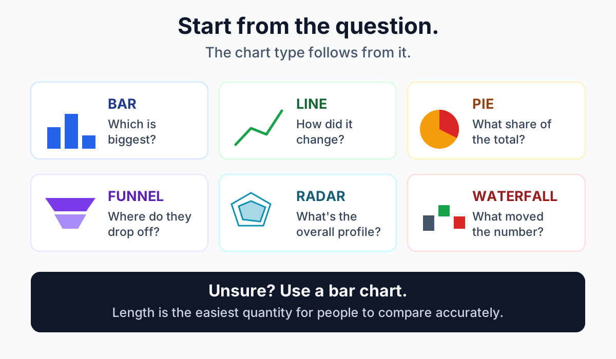
Start with the question, not the data
Before choosing a chart, finish this sentence: “After seeing this, the reader should be able to decide ___.” If you can’t finish it, no chart type will save the slide, the problem is upstream.
That one question usually settles the format:
| Your question | Chart | Why |
|---|---|---|
| Which category is biggest? | Bar | Bar length is the easiest visual quantity to compare |
| How has it changed over time? | Line | The connected line makes the trend the subject |
| What share of the total is each part? | Pie / donut | Slices read as fractions of one whole |
| Where are people dropping off? | Funnel | The narrowing shape is the drop-off |
| What’s this thing’s overall profile? | Radar | The polygon’s shape shows strengths at a glance |
| What moved the number? | Waterfall | Floating bars attribute each gain and loss |
Bar charts: the default choice
Bar charts compare values across discrete categories, products, days, regions, survey options. They work because humans judge length far more accurately than angle, area or colour intensity. That single perceptual fact is why a bar chart is almost always a defensible choice, and why it carries more information per square inch than a pie.
Use a bar chart when your categories are independent of one another and you want the reader to rank or compare them. Sort the bars by value unless the categories have a natural order (days of the week, age bands), an unsorted bar chart makes the reader do work you could have done for them.
One rule that matters more than any other: start the value axis at zero. Bars encode value by length, so truncating the axis exaggerates small differences and is the single most common way a chart misleads. (Line charts, which encode change, can reasonably use a non-zero baseline, but say so.)
Build one with the bar chart maker.
Line charts: change over an ordered sequence
Line charts show a trend. The connecting line implies that the points are part of a continuous progression, so the x-axis must have a real order, months, weeks, versions, dose levels. Using a line for unordered categories is a quiet error: it invents a trend that doesn’t exist.
Line charts also handle far more data points than bars before becoming unreadable, which makes them the right pick for dense time series. Use the line chart maker.
Pie charts: a narrow but real niche
Pie charts get more criticism than they deserve and are still used more than they should be. They’re the right choice when three conditions all hold:
- The values sum to a meaningful total (a budget, 100% of traffic, not “average score by team”).
- The reader cares about part-to-whole, not part-to-part comparison.
- There are few slices, roughly five at most.
Break any of those and a bar chart communicates better. The reason is again perceptual: comparing two similar slices means comparing angles, which people do poorly. If your reader’s job is “rank these,” don’t make them measure angles.
A donut is the same chart with the middle removed; it reads slightly better for part-to-whole because it de-emphasises the angle-at-the-centre and frees the middle for a total. Both are in the pie & donut chart maker.
Funnel charts: sequential drop-off
A funnel shows how many people or items survive each step of an ordered process, visitors → sign-ups → trials → paid. The narrowing shape encodes the drop-off, and the biggest single narrowing is your bottleneck.
The condition that makes a funnel honest: each stage must be a subset of the one above it. If your stages are just categories that happen to be different sizes, a funnel implies a sequence that isn’t there, use a bar chart. See the funnel chart maker.
Radar charts: comparing a profile
A radar (or spider) chart plots several attributes on axes radiating from a centre and joins them into a polygon. It’s good at one specific thing: showing the overall shape of something measured across multiple dimensions, a skill set, a product’s ratings, a character’s stats.
Its weaknesses are worth knowing. Reading precise values off a radar is hard, the shape changes depending on the arbitrary order of the axes, and it needs at least three axes (and gets crowded past eight or so). Attributes should also share a comparable scale, or one large-numbered axis will dominate. If precise comparison matters more than gestalt, use a bar chart. Try the radar chart maker.
Waterfall charts: what moved the number
A waterfall (or bridge) chart starts from an opening value and shows each subsequent gain and loss as a floating bar, landing on the closing value. It answers “revenue went from X to Y, what happened in between?” better than any other format, which is why it’s a staple of finance and variance analysis.
Use it for profit bridges, budget variance, headcount movement, inventory changes, anywhere a single number’s movement needs attributing to causes. Enter decreases with a minus sign in the waterfall chart maker.
Four mistakes that make charts mislead
- Truncated bar axes. Starting a bar chart’s axis at 90 instead of 0 turns a 3% difference into a visual doubling.
- Pie charts with 9 slices. Nobody can rank them. Use a sorted bar chart.
- Lines over unordered categories. Implies a trend between things that have no sequence.
- Too many series. Beyond about five lines or series, colour-matching becomes the reader’s whole job. Split into small multiples instead.
Frequently asked questions
What is the most commonly used chart type?
Bar and column charts, by a wide margin. They compare discrete categories accurately and suit a huge range of data. Line charts are second, used wherever the story is change over time. When in doubt, a bar chart is the safest default.
When should I use a pie chart instead of a bar chart?
Only when the values sum to a meaningful whole, the part-to-whole relationship is the point, and there are about five slices or fewer. If the reader needs to rank or precisely compare the segments, a bar chart is easier to read.
What’s the difference between a bar chart and a histogram?
A bar chart compares separate categories, so the bars have gaps and can be reordered. A histogram shows the distribution of one continuous variable split into bins, so the bars touch and their order is fixed. They look similar but answer different questions.
How many slices can a pie chart have?
Aim for five or fewer. Beyond that, slices get thin, labels collide, and comparing similar angles becomes guesswork. Group small categories into an “Other” slice, or switch to a sorted bar chart.
Should a bar chart always start at zero?
Yes. Bars encode value as length, so a non-zero baseline visually exaggerates differences. Line charts, which encode change rather than magnitude, can use a non-zero baseline, but label the axis clearly so readers aren’t misled.
When is a waterfall chart better than a bar chart?
When you’re explaining movement rather than comparing levels. If the question is “why did profit fall from 1.2M to 0.9M,” a waterfall attributes each contributing gain and loss. If the question is “which region had the highest profit,” use a bar chart.
Is a radar chart the same as a spider chart?
Yes, radar, spider and web chart all describe the same multi-axis plot. They’re best for showing an overall profile across several comparable attributes rather than for reading exact values.
Frequently asked questions
What chart type should I use for my data?
Start from the question you're answering, not the data you have. To compare separate categories use a bar chart, to show change over time use a line chart, and to show slices of one total use a pie chart. If none fit, consider a funnel, radar or waterfall chart.
Should I use a bar chart or a pie chart?
Prefer a bar chart for precise comparison. People judge length far more accurately than angle or area, so bars let readers rank values reliably, while pie slices are hard to compare. Reserve pie charts for showing a few parts of one meaningful total, ideally about five slices or fewer.
When should I use a line chart instead of a bar chart?
Use a line chart when your data follows an ordered sequence, usually time, and you want the trend itself to be the subject. The connected line emphasises change and direction. Bar charts are better when the categories are independent and have no natural order.
What is the default chart type when I am unsure?
A bar chart is the safest default. It is the most versatile and the easiest to read accurately because bar length is the simplest visual quantity to compare, so it is almost always a defensible choice.
When should I use a funnel, radar or waterfall chart?
Use a funnel chart for sequential stages where each stage is a subset of the one above, such as conversion drop-off. Use a radar chart to compare several attributes measured on a similar scale. Use a waterfall chart to explain how a starting value became an ending value through gains and losses.