
explainer
How Do Font Generators Work? (They're Not Fonts, They're Unicode)
By Uttam Regmi · Published 2026-07-26 · Updated 2026-07-26 · 7 min read · Fact-checked, sources cited
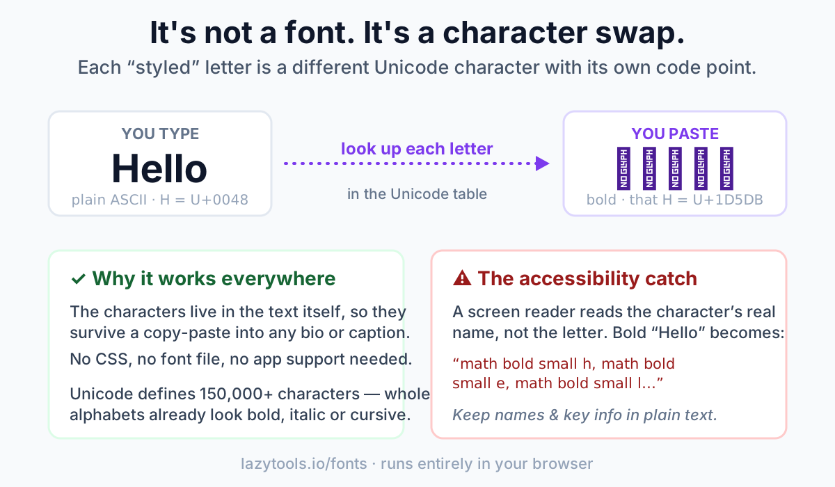
A font generator doesn’t change your font. It swaps each letter for a different character that already looks styled. When you paste ”𝗛𝗲𝗹𝗹𝗼” into an Instagram bio, you’re not applying bold formatting; you’re pasting five distinct Unicode characters (the “Mathematical Bold” letters) that happen to be shaped like a bold H, e, l, l and o. That’s why the effect survives a copy-paste into apps that have no styling controls at all, the style is baked into the characters themselves, not into any font file.
Fonts vs. characters: the distinction that explains everything
In normal typography, the character and its appearance are separate things. The letter “H” is one character (code point U+0048). Whether it looks like Times New Roman, Helvetica or Comic Sans is decided by the font, a separate file the app applies at display time. Change the font and the same character looks different.
Instagram, TikTok and X captions don’t give you a font picker. So generators do an end-run around the problem: instead of changing how a character is drawn, they change which character you’re using. Unicode, the standard that assigns a number to every character, now more than 150,000 of them, contains whole alphabets that were designed to look bold, italic or script. Swap your plain letters for those, and the “styling” comes along for free, because it was never styling in the first place. It’s just different letters.
That’s the whole trick. Everything else is detail.
Where the styled letters come from
Most of what a fancy text generator produces lives in one Unicode block: Mathematical Alphanumeric Symbols, spanning U+1D400 to U+1D7FF. It was added so mathematicians could write things like a bold vector v or a script ℒ distinctly from a normal variable, but the side effect is a full set of pre-styled Latin alphabets and digits.
| Style you see | Where it comes from | Example |
|---|---|---|
| Bold | Math Bold (U+1D400+) | 𝐇𝐞𝐥𝐥𝐨 |
| Italic | Math Italic (U+1D434+) | 𝐻𝑒𝑙𝑙𝑜 |
| Script / cursive | Math Script (U+1D49C+) | ℋℯ𝓁𝓁ℴ |
| Fraktur | Math Fraktur (U+1D504+) | ℌℯ𝔩𝔩𝔬 |
| Double-struck | Math Double-Struck (U+1D538+) | ℍ𝕖𝕝𝕝𝕠 |
| Sans-serif bold | Math Sans Bold (U+1D5D4+) | 𝗛𝗲𝗹𝗹𝗼 |
| Monospace | Math Monospace (U+1D670+) | 𝙷𝚎𝚕𝚕𝚘 |
Other styles borrow from different corners of Unicode: small caps come from the phonetic-extensions and Latin blocks (ʜᴇʟʟᴏ), circled/“bubble” letters from Enclosed Alphanumerics (Ⓗⓔⓛⓛⓞ), and wide/“vaporwave” text from the Fullwidth Forms block (Hello). Strikethrough and underline are done differently again, with combining marks (U+0336 and U+0332) layered on top of ordinary letters.
Why a few letters go missing
The Mathematical Alphanumeric Symbols block has gaps. Several letters that Unicode had already defined elsewhere, as “Letterlike Symbols”, were deliberately left out to avoid duplicates. So the script capital B isn’t in the math block; it’s the earlier ℬ (U+212C). The double-struck ℝ, ℂ, ℕ, ℚ, ℤ and the fraktur ℭ, ℌ, ℑ, ℜ, ℨ are the same story.
A naïvely built generator that only reads the math block leaves those letters as blank boxes (□). A good one patches every gap from the Letterlike Symbols block so the output is complete, which is exactly what the font generator here does. If you’ve ever used a generator where “Robert” came out with a missing R in script style, you’ve seen the gap that wasn’t patched.
Why it works in your bio (and why it sometimes doesn’t)
Because the style is encoded in the characters, pasting styled text works anywhere that accepts Unicode text, bios, captions, comments, display names, messaging apps, most documents. There’s no font to install and no formatting menu required. That universality is the entire appeal.
Two caveats explain the occasional failure:
- Rendering depends on the device’s fonts. A character only displays if the reader’s system has a glyph for it. Modern phones and browsers cover the math alphabets well, but on an old device an exotic style may show as boxes. The text is still “correct”, the viewer’s system just can’t draw it.
- Some platforms filter characters. A few apps strip certain code points (often the combining marks behind “glitch” text) to prevent abuse, so those styles can silently revert to plain letters.
The accessibility cost, the part most guides skip
This is the trade-off worth taking seriously. A screen reader announces characters by their Unicode name, not by the letter they resemble. Your bold “Hello” isn’t stored as H-e-l-l-o; it’s five math characters. So a blind user doesn’t hear “Hello”. They hear something closer to “mathematical bold small h, mathematical bold small e, mathematical bold small l…”, letter by letter. A styled name can become almost unlistenable.
Search engines and copy-paste can struggle too: the styled text no longer matches the plain word, so it may not be found by search or read cleanly by other tools.
None of this means “never use fancy text.” It means use it where it’s decorative, and keep the load-bearing information, your actual name, a phone number, a link, a call to action, in ordinary letters. A tasteful styled word next to plain, readable text is the version that works for everyone.
How to use it well
- Style one thing, not everything. A single bold or script word draws the eye; a whole styled paragraph is hard to read and hard to hear.
- Keep your handle and key facts plain. Names, numbers and links should be normal text so they’re searchable, tappable and screen-reader friendly.
- Check it on a phone before you commit. Confirm the style renders where your audience will actually see it.
- Prefer a generator that patches the gaps so you don’t get missing letters in script, fraktur or double-struck styles.
Want to see the swap happen in real time? Paste any word into the fancy font generator and watch it appear in every style at once, then copy the one you want. It runs entirely in your browser; nothing you type is uploaded.
FAQ
Are Instagram fonts real fonts? No. They’re Unicode characters that look styled. Instagram has no font picker, the “font” you paste is just a different set of characters that happen to be shaped like bold, italic or cursive letters.
Why does the styled text stay styled when I paste it? Because the style is part of the characters themselves, not a formatting layer. Copy-paste moves the characters, so the appearance moves with them, no font or CSS needed on the other end.
Why do some letters show up as empty boxes? Either the generator didn’t fill a gap in the Unicode math block (some script/fraktur/double-struck letters live in a different block), or your device lacks a glyph for that character. A generator that patches the Letterlike-Symbols gaps avoids the first problem.
Is fancy text bad for accessibility? It can be. Screen readers read the characters’ Unicode names instead of the plain letters, so styled text can be tedious or confusing to hear. Keep names, numbers and links in plain text and use styling only for decoration.
Will fancy text hurt my SEO or searchability? Styled Unicode doesn’t match the plain word, so it may not be found by in-app search or indexed as the normal term. Don’t put keywords you want found into fancy characters.
Can I use this text in a username or password? Usernames sometimes accept it, sometimes not, many platforms restrict handles to plain characters. Never use fancy Unicode in a password; login systems compare exact bytes and you may lock yourself out.
Do I need to install anything? No. Everything is standard Unicode. You type, you copy, you paste, no fonts, apps or downloads involved, and with a client-side tool nothing you enter leaves your device.
Frequently asked questions
Are Instagram and TikTok 'fonts' real fonts?
No. They are not fonts at all. A font generator swaps each letter for a different Unicode character that already looks bold, italic or cursive, so nothing is downloaded or installed.
Why do these styled letters survive copy-paste into any app?
Because the style is baked into the characters themselves, not into a font file or CSS. The look-alike Unicode characters live inside the text, so they travel with it wherever you paste.
Where do the styled characters come from?
Most come from the Mathematical Alphanumeric Symbols block (U+1D400 to U+1D7FF), which contains ready-made bold, italic, script, fraktur, double-struck, sans-serif and monospace alphabets and digits.
Are Unicode fonts bad for accessibility?
They carry an accessibility cost. A screen reader reads the character's real name, such as 'mathematical bold small h', instead of 'h'. Keep names and key facts in plain text so they stay readable.
Why do some letters fall back to plain text?
Not every character exists in every style, and some platforms strip certain characters. When a match is missing or removed, that letter shows up in its plain form instead.