
explainer
CSS Animations with @keyframes: A Practical Guide
By Uttam Regmi · Published 2026-11-13 · Updated 2026-11-13 · 4 min read · Fact-checked, sources cited
A CSS animation has two parts: a @keyframes rule that defines what changes over time, and the animation property that plays it with a duration, timing, delay and iteration count. The keyframes rule lists the CSS values at stages from 0% to 100% (or from and to), and the browser smoothly interpolates between them. Unlike a transition, an animation can run on its own, loop forever, and move through many steps, which is why it powers everything from fade-in entrances to loading spinners. Build and preview one without writing the boilerplate using the CSS Animation Generator.
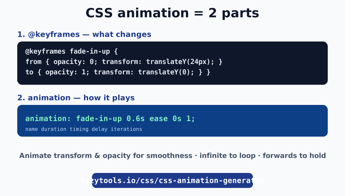
The two pieces of every CSS animation
Every animation is a keyframes rule plus the property that applies it.
1. The @keyframes rule names the animation and lists the stages:
@keyframes fade-in-up {
  from { opacity: 0; transform: translateY(24px); }
  to   { opacity: 1; transform: translateY(0); }
}
You can use from/to for a simple two-step animation, or percentages (0%, 50%, 100%) for more stages.
2. The animation property plays it on an element:
.card {
  animation: fade-in-up 0.6s ease 0s 1;
  /*         name       dur   ease delay count */
}
That is the shorthand for animation-name, animation-duration, animation-timing-function, animation-delay and animation-iteration-count. The browser then interpolates the element from the first keyframe to the last over the duration. MDN’s Using CSS animations guide is the complete reference.
Animation vs transition: which to use
They look similar but solve different problems.
| Transition | Animation | |
|---|---|---|
| Steps | Two (start → end) | Many (@keyframes) |
| Needs a trigger | Yes (hover, class change) | No, can run on load |
| Can loop | No | Yes (infinite) |
| Best for | Hover effects, toggles | Entrances, loaders, attention |
Use a transition when something changes between two states, like a button darkening on hover. Use an animation when you need multiple steps, looping, or motion that starts by itself when the page loads.
The animation properties you will actually use
animation-duration(e.g.0.6s): how long one cycle takes.animation-timing-function(e.g.ease,linear,cubic-bezier(...)): the acceleration curve. Craft a custom one with the cubic-bezier generator.animation-delay(e.g.0.2s): wait before starting. Stagger several elements by increasing the delay.animation-iteration-count:1for a one-shot,infiniteto loop. Spinners useinfinite.animation-fill-mode:forwardskeeps the final keyframe’s styles after the animation ends, which you want for an entrance that should stay in its end state (otherwise the element snaps back to its pre-animation style).animation-play-state:pausedorrunning, handy to pause on hover.
Keep it smooth: animate transform and opacity
The single biggest performance rule: animate transform and opacity, not layout properties. Transforms (translate, scale, rotate) and opacity are composited by the browser on the GPU, so they animate at 60fps without touching layout. Animating width, height, top, left, margin or padding forces the browser to recalculate layout on every frame, which is slow and can make the animation stutter (jank).
So instead of animating left to slide something in, animate transform: translateX(). Instead of animating height to collapse a panel, consider transform: scaleY() or a max-height trick. Your animations will be noticeably smoother.
Looping animations: spinners and pulses
For anything that repeats, set infinite:
@keyframes spin { to { transform: rotate(360deg); } }
.loader { animation: spin 1s linear infinite; }
linear timing keeps a spinner turning at a constant speed (an ease would make it lurch). A pulsing attention effect works the same way with a scale keyframe and infinite. In fact, pure-CSS loading spinners are just a looping transform animation, covered in how to make a CSS loading spinner.
Staggering and chaining
Two patterns make animations feel polished:
- Stagger a list by giving each item an increasing
animation-delay(item 1 at 0s, item 2 at 0.1s, and so on), so they cascade in rather than appearing at once. - Chain multiple animations on one element by comma-separating them:
animation: fade 0.5s ease, slide 0.5s ease 0.5s;runs a fade, then a slide after it.
Both are easy to overdo; a little motion guides attention, a lot distracts. Respect users who prefer less motion with a @media (prefers-reduced-motion: reduce) block that disables or tones down animations.
Build it visually
CSS animations come down to two things: a @keyframes rule describing the change, and the animation property setting how long it takes and how often it plays. Favour transform and opacity for smoothness, use infinite for loops and forwards to hold an end state, and keep motion purposeful.
The quickest way to design one is to watch it play. The CSS Animation Generator offers presets (fade, slide, bounce, pulse, spin and more), live playback, and copyable @keyframes plus animation code, part of the full CSS and design toolkit. Pair it with the cubic-bezier generator for custom easing.
The authoritative reference is MDN’s Using CSS animations guide.
Frequently asked questions
How do CSS @keyframes work?
A @keyframes rule defines the stages of an animation, from 0% to 100% (or from and to), listing the CSS values at each point. You then apply it with the animation property, which sets the duration, timing function, delay, iteration count and the keyframes name. The browser interpolates between the keyframes over time.
What is the difference between a CSS animation and a transition?
A transition animates between two states and needs a trigger such as hover or a class change, start and end only. An animation uses @keyframes to move through many steps, can loop, and can run automatically on load with no trigger. Use transitions for simple state changes, animations for multi-step or looping motion.
How do I make a CSS animation loop forever?
Set the iteration count to infinite, for example animation: spin 1s linear infinite. The animation restarts from the first keyframe each cycle. This is how spinners and pulsing effects run continuously.
Which CSS properties are smooth to animate?
transform (translate, scale, rotate) and opacity, because the browser composites them on the GPU without recalculating layout. Animating width, height, top, left, margin or padding triggers layout on every frame and can cause jank, so avoid those where you can.
What does animation-fill-mode do?
It controls what styles apply before the animation starts and after it ends. forwards keeps the final keyframe's styles after the animation finishes (useful for a one-shot entrance that should stay in its end state); backwards applies the first keyframe during any delay; both does both.
How do I pause a CSS animation?
Set animation-play-state: paused (and running to resume). A common pattern is to pause on hover with :hover { animation-play-state: paused }. The animation freezes at its current frame and resumes from there.
Can I run multiple animations on one element?
Yes. Separate them with commas in the animation property, for example animation: fade 1s ease, slide 1s ease. Each runs with its own timing. You can also animate different properties in each keyframes rule.