
how-to
How to Make a CSS Loading Spinner (No JavaScript)
By Uttam Regmi · Published 2026-11-13 · Updated 2026-11-13 · 4 min read · Fact-checked, sources cited
To make a loading spinner in CSS, take a square element, give it a border with one side a different colour, round it into a circle with border-radius: 50%, and spin it with a @keyframes rotate animation, no image and no JavaScript. That classic rotating ring is just a handful of lines, and the same idea (an element plus a keyframes animation) produces bouncing dots, pulsing bars and more. Pure-CSS spinners are tiny, crisp at any size, and recolour with a single value. Design one with adjustable size, colour and speed using the CSS Loader Generator.
The classic ring spinner
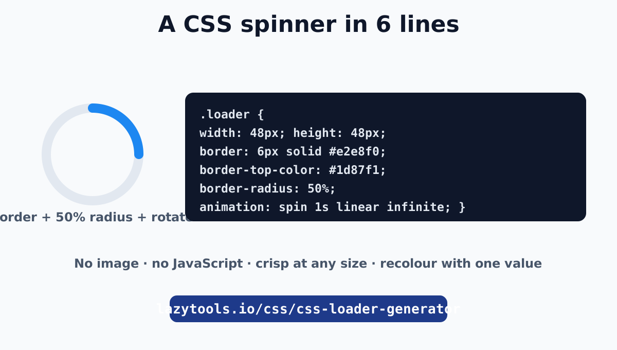
Here is the whole thing:
.loader {
  width: 48px;
  height: 48px;
  border: 6px solid #e2e8f0;        /* the faint ring */
  border-top-color: #1d87f1;        /* the coloured arc */
  border-radius: 50%;               /* make it a circle */
  animation: spin 1s linear infinite;
}
@keyframes spin { to { transform: rotate(360deg); } }<div class="loader"></div>That is it. The square becomes a circle because of border-radius: 50%; the ring is the full border; the single coloured border-top-color is the arc that appears to chase around as the whole element rotates. The animation turns it a full 360 degrees, on a linear timing so it spins at a constant speed, and infinite so it never stops. MDN’s Using CSS animations covers the animation mechanics.
Why linear timing and rotate
Two details make a spinner feel right:
lineartiming. A spinner should turn at a steady pace. The defaulteasewould speed up and slow down each cycle, giving an odd lurching rotation. Always uselinearfor continuous spinners.transform: rotate(). Rotating via transform is composited on the GPU, so the spin stays smooth even on a busy page. Never animate a spinner with layout properties.
Other pure-CSS loaders
The same element-plus-keyframes recipe gives you different looks:
Bouncing dots scale three circles in and out with staggered delays:
.loader { display: inline-flex; gap: 8px; }
.loader div { width: 12px; height: 12px; border-radius: 50%; background: #1d87f1;
  animation: bounce 1s ease-in-out infinite; }
.loader div:nth-child(2) { animation-delay: 0.15s; }
.loader div:nth-child(3) { animation-delay: 0.3s; }
@keyframes bounce { 0%, 80%, 100% { transform: scale(0); } 40% { transform: scale(1); } }
Pulsing bars scale their height on a loop, again with staggered delays. A pulse circle grows and fades with a scale-and-opacity keyframe. In every case the pattern is identical: a shape, a @keyframes rule animating transform (and sometimes opacity), and an infinite loop. The loader generator builds all of these with sliders for size, colour and speed.
Sizing, colour and speed
Because a spinner is pure CSS, three values control its whole appearance:
| You want | Change |
|---|---|
| Bigger / smaller | width and height (and border thickness for rings) |
| Different colour | the border-top-color (ring) or background (dots/bars) |
| Faster / slower | the animation duration (smaller = faster) |
This is the big advantage over an animated GIF: a spinner scales crisply to any size, recolours to match your theme with one value, and weighs a few bytes instead of a few kilobytes.
Centring the spinner
To drop a spinner in the middle of the screen or a region, wrap it in a flex container:
.loading-overlay {
  display: flex;
  justify-content: center;
  align-items: center;
  min-height: 100vh;      /* or the height of the area */
}
Flexbox centres the spinner on both axes regardless of its size. (More on centring in CSS Grid vs Flexbox.)
Making it accessible
A spinner is purely visual, so screen-reader users get nothing from it unless you tell them something is happening:
- Put
aria-busy="true"on the container while it loads, and remove it when done. - Or include an
aria-live="polite"region with text like “Loading…” so it is announced. - Respect motion preferences: wrap or guard the animation with
@media (prefers-reduced-motion: reduce)and reduce or remove the spin for users who find motion uncomfortable.
The spinner then complements an accessible loading signal rather than being the only indication.
Build one in seconds
A CSS loading spinner is one of the most satisfying small bits of CSS: an element, a border or a few shapes, and a looping transform animation, no images, no libraries, no JavaScript. Keep the timing linear, animate transform, recolour and resize with single values, and add an accessible loading cue.
Skip the fiddly bits with the CSS Loader Generator: pick a style (ring, dual-ring, dots, bars, pulse), set the size, colour and speed, and copy the HTML and CSS. It lives in the CSS and design toolkit alongside the CSS Animation Generator.
The animation fundamentals are documented in MDN’s Using CSS animations guide.
Frequently asked questions
How do I make a loading spinner in CSS?
Make a square element, give it a border, colour one side differently, round it fully with border-radius: 50%, and rotate it with a keyframes animation. That is the classic ring spinner: a few lines of CSS, no image or JavaScript. The LazyTools loader generator builds this and other styles for you.
Do CSS spinners need JavaScript?
No. A spinner is purely an HTML element plus a CSS @keyframes animation, so there is no JavaScript and no image request. You add it to the page while content loads and remove it (or hide it) when loading finishes, which is the only part JavaScript might handle.
How do I change a CSS spinner's speed and colour?
Speed is the animation duration, a smaller value spins faster. Colour is a single border-color (for a ring) or background value (for dots and bars). Because it is pure CSS, changing one value updates the whole spinner, and it stays crisp at any size.
How do I centre a loading spinner on the page?
Put it in a flex container that fills the area and centre it: display: flex; justify-content: center; align-items: center; min-height: 100vh (or the height of the region). The spinner then sits in the middle regardless of its size.
Are CSS loading spinners accessible?
A spinner alone is invisible to screen readers. Add aria-busy="true" to the loading container, or an aria-live region with text like "Loading…", so assistive-technology users know content is coming. Also respect prefers-reduced-motion for users who find spinning motion uncomfortable.
Why use a CSS spinner instead of an animated GIF?
A CSS spinner is a few bytes of markup, scales crisply to any size, recolours with one value, and animates smoothly on the GPU. A GIF is a fixed-resolution image file that is larger, blurs when scaled, and cannot be restyled. CSS wins on size, quality and flexibility.